
Acquiso: Brand Identity



Apr 2024
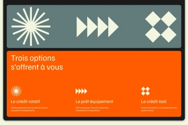
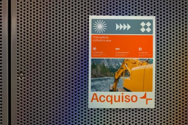
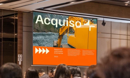
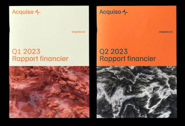
Clairoux Studio developed a comprehensive brand identity for Acquiso, a project that bridges the gap between industrial operations and accessible financial solutions. The visual system leverages a high-contrast palette of vibrant orange, teal, and slate grey, applied across a wide range of assets including digital billboards, financial report brochures, and mobile interface design. Technically rooted in minimalist graphic design, the identity utilizes clean sans-serif typography and bespoke geometric iconography. The creative execution incorporates motion graphics to animate the core typographic system, paired with live-action footage that grounds the brand within its sector of heavy machinery and equipment procurement. The system is designed for flexibility, maintaining a consistent professional aesthetic across both physical print collateral and urban digital displays.
Horizontal, Commercial, Clean
