
Bilker Bunker: Brand Identity
Feb 2024
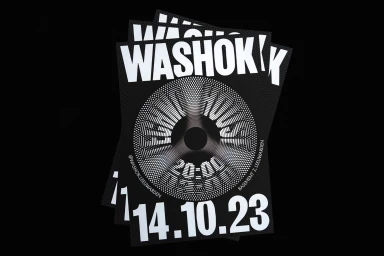
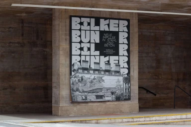
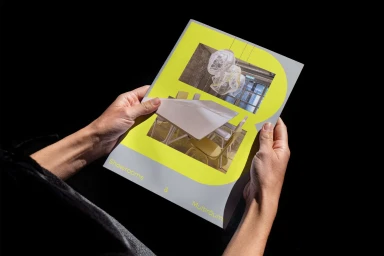
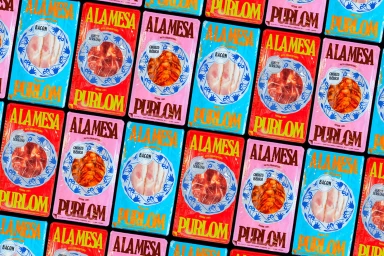
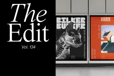
Bilker Bunker presents a comprehensive brand identity project that explores the intersection of brutalist architecture and modular graphic design. The system is built upon a foundation of bold, high-contrast typography and geometric patterns, expressed through both print collateral and motion-led assets. By integrating 3D rendering and motion graphics, the project creates a dynamic brand presence that moves between monochromatic austerity and vibrant, structured color palettes. The visual identity leans into clean layout systems, utilizing techniques such as screen printing and CGI to bridge the gap between physical material and digital animation. The work, developed by a collaborative team including g31, Sophie Tyrrell, Fabrizio Morra, Jilesen—Keizer, and Onmi Design, spans across product packaging, event posters, and editorial materials to establish a versatile brand ecosystem.
Horizontal, Commercial
Typography


