
AWO: Brand Identity

Aug 2020
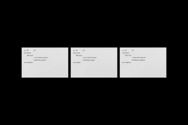
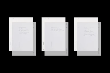
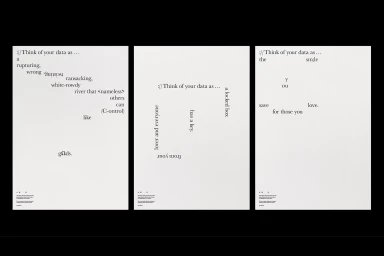
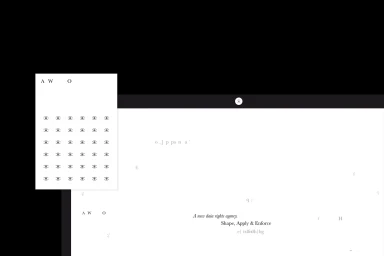
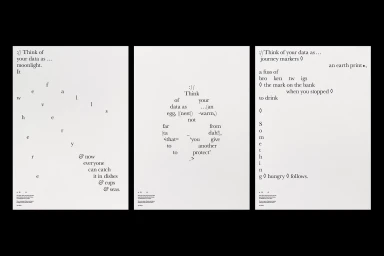
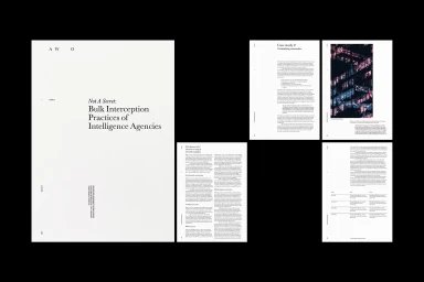
The brand identity for AWO, meticulously crafted by Accept & Proceed, serves as a masterclass in minimalist corporate communication and editorial design. By leveraging a high-contrast monochromatic palette and a disciplined grid system, the project establishes a visual language that feels both academically rigorous and profoundly modern. The identity leans into the tension between stark black negative space and precise white architectural forms, utilizing experimental typography to ground complex concepts surrounding data rights and intelligence practices. Throughout the collateral, including business cards, document covers, and long-form research reports, the design maintains a sharp, intellectual sensibility. The use of clean serif and sans-serif typefaces acts as the anchor, guiding the viewer through dense information with unexpected, poetic layouts that emphasize rhythm and clarity. This corporate identity project successfully avoids the pitfalls of generic branding by integrating artistic UI illustration elements and unconventional alignments, ensuring the brand mark remains both functional and evocative. Through deliberate precision and a focus on structural harmony, Accept & Proceed has elevated AWO from a mere service entity into a sophisticated, information-forward brand. The overall execution reflects a commitment to the philosophy of shape, apply, and enforce, resulting in a cohesive system that effectively bridges the gap between raw data and accessible, high-end visual storytelling in a competitive commercial landscape.
Horizontal, Clean, Minimalist, Commercial
Typography
Advertising Campaign
