
Apoticari: Brand Identity





Brand
Date
Jul 2025
Description
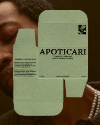
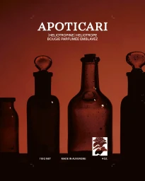
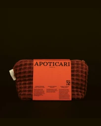
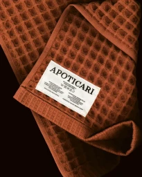
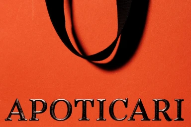
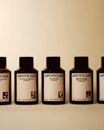
Apoticari introduces its brand identity through a series of product and packaging assets that focus on material contrast and botanical themes. The project explores the intersection of skincare and personal care, utilizing minimalist typography and tactile elements to ground the brand's aesthetic. GeneralPublic developed the graphic identity, incorporating clean lines and deliberate monochrome contrast. The imagery employs techniques such as emboss & deboss to highlight the physical texture of packaging, while warm, earthy tones unify the apothecary-inspired collection of glass vessels and textile components.
Style
Vertical, Clean, Commercial
Context
E-commerce / Product
Associated creatives

5000+ creatives to discover
Sign up to gain access to the entire directory. It’s free.
Visie is a curated library of creative professionals.