
Agronod: Brand Identity




Sep 2024
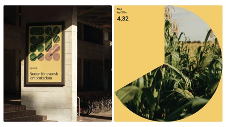
The brand identity for Agronod, developed by EY Doberman, establishes a cohesive visual system for the agricultural technology sector. The design language relies on a minimalist aesthetic, utilizing a distinct warm yellow and green color palette, clean typography, and precise geometric forms. Across multiple applications, the identity balances technical data visualization with organic motifs, including aerial crop photography and fluid patterns. The project system extends from corporate print assets and signage to digital UI illustration, demonstrating a versatile approach to modern enterprise branding through vector graphics and consistent layout structures.
Commercial, Clean, Horizontal, Graphic
Typography
Brand Film / Corporate Video, Advertising Campaign
