Acure: Brand Identity

Oct 2025
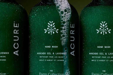
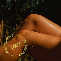
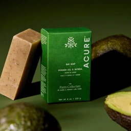
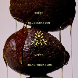
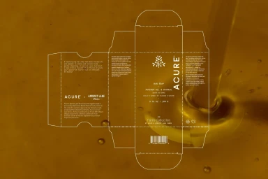
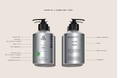
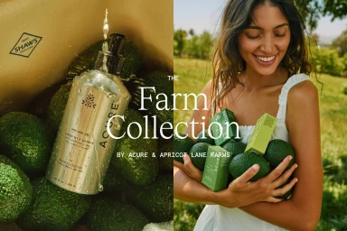
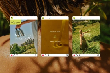
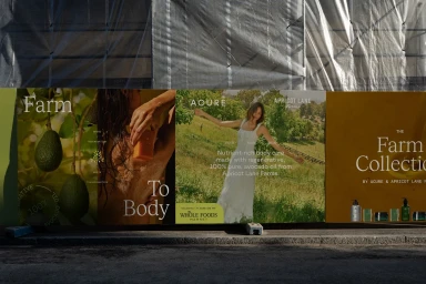
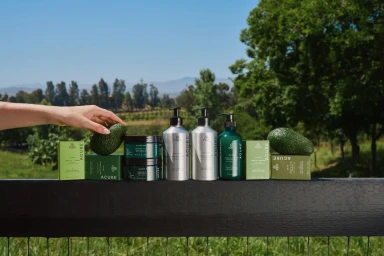
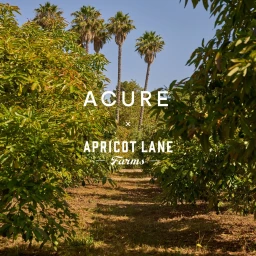
Acure’s brand identity project establishes a visual language centered on the intersection of skincare and natural ingredients. The campaign employs a mix of commercial product photography and graphic design to link the tactile qualities of the range with its botanical origins, utilizing clean studio lighting and macro techniques to emphasize texture and product finish. Developed by photographer Henry Hargreaves and graphic design studio Mostly Sunny, the creative direction integrates professional product shots with outdoor, warm-toned lifestyle imagery. The work features a recurring motif of fresh avocados and golden liquid textures, presented across packaging die-lines, social media mockups, and large-scale billboard installations. The identity relies on a minimalist aesthetic to highlight ingredient transparency and brand consistency across diverse media formats.
Horizontal, Commercial, Clean