
Brand
ProjectBrand Identity
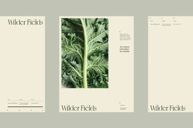
Wilder Fields Brand Identity 2020
Associated creatives


Tags
Description
This project showcases the comprehensive brand identity and stationery design created for Wilder Fields. The layout features a sophisticated, cream-toned palette paired with custom minimalist serif typography and clean editorial alignment. A central panel displays a macro photographic study of a vibrant green leafy vegetable stem glistening with water droplets, emphasizing freshness and natural quality. The collateral pieces include letterheads and brand touchpoints arranged with generous negative space and clear contact hierarchies. The overall aesthetic is polished, restrained, and modern, reflecting sustainable agricultural roots through clean graphic execution.