
Ceelike breaks oral care conventions Studioenok’s identity for Ceelike breaks oral care conventions 2026
Associated creatives

Tags
Description
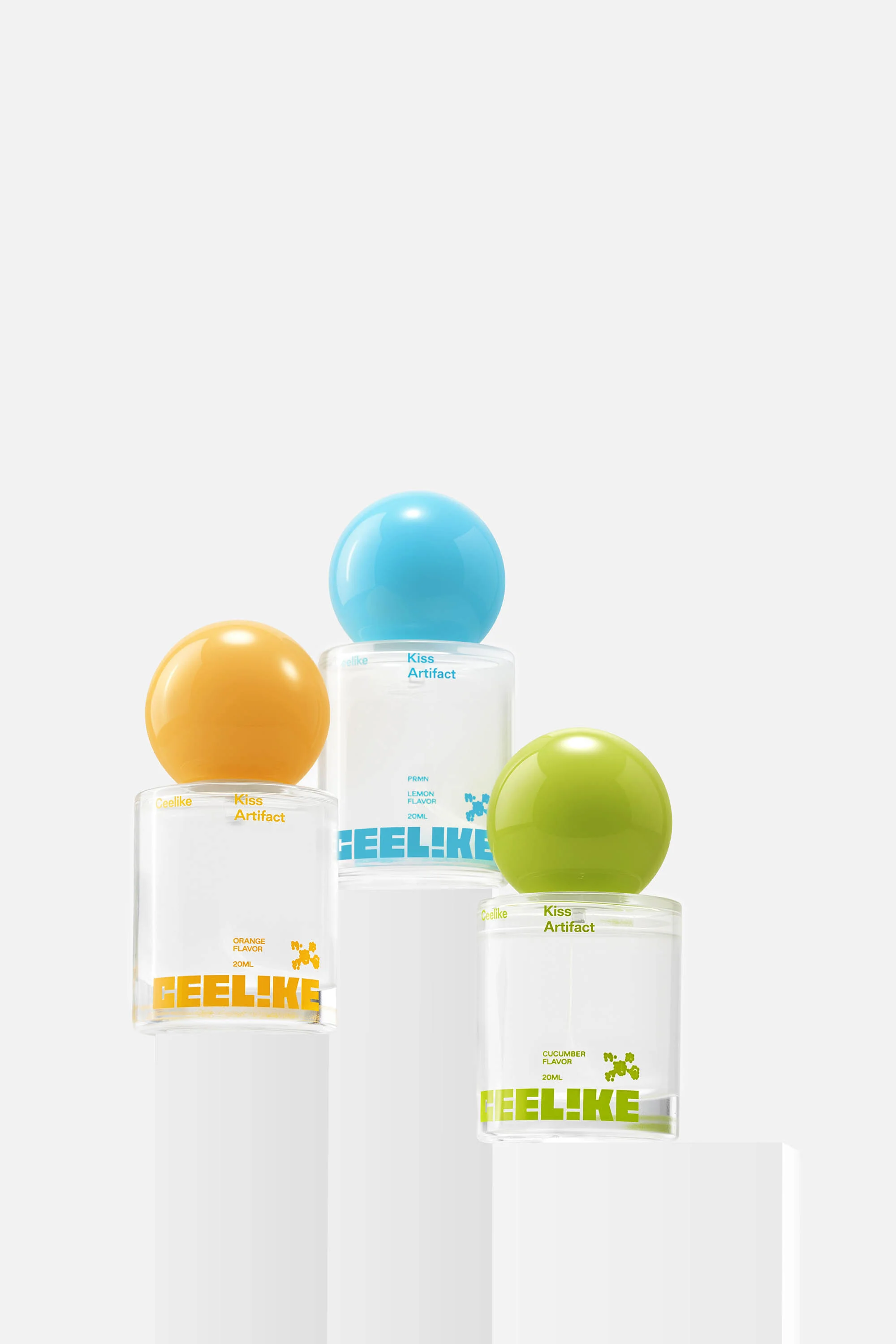
Studioenok creates a striking visual identity for Ceelike oral care, breaking traditional conventions with modern packaging design. Three transparent bottles featuring distinctive spherical caps in yellow, blue, and green are arranged on stepped white pedestals. The clean studio composition highlights the minimalist containers and bold typography printed on the glass. Soft, even lighting eliminates harsh shadows, emphasizing the smooth surfaces and vibrant colors of the caps. Graphic Design by Studioenok.
Style
Vertical, Commercial, Clean, Minimalist
Industries
Cosmetics
Color
Golden Yellow (30%)
Sky Blue (30%)
Lime (30%)
Background
White Seamless
Context
E-commerce / Product