
Ceelike breaks oral care conventions
Studioenok’s identity for Ceelike breaks oral care conventions

Date
Jan 2026
Description
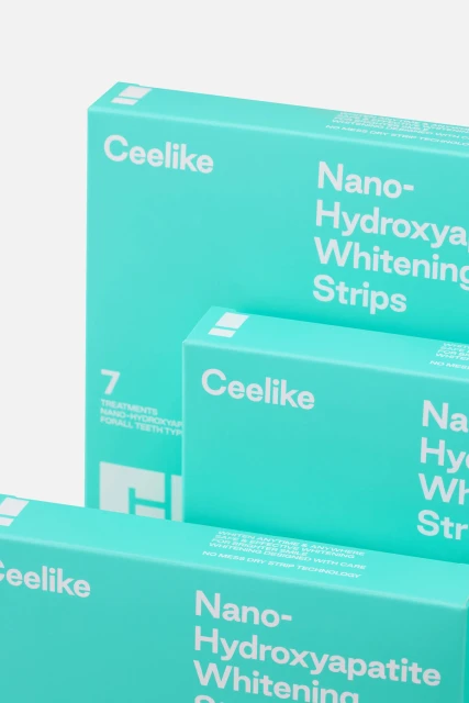
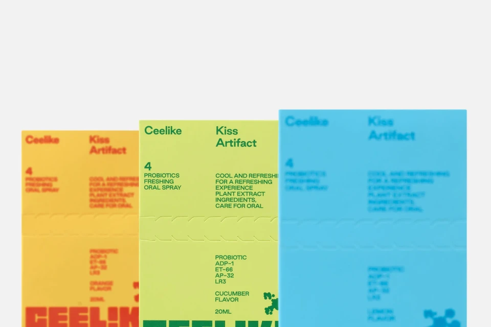
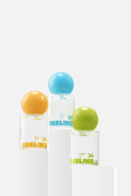
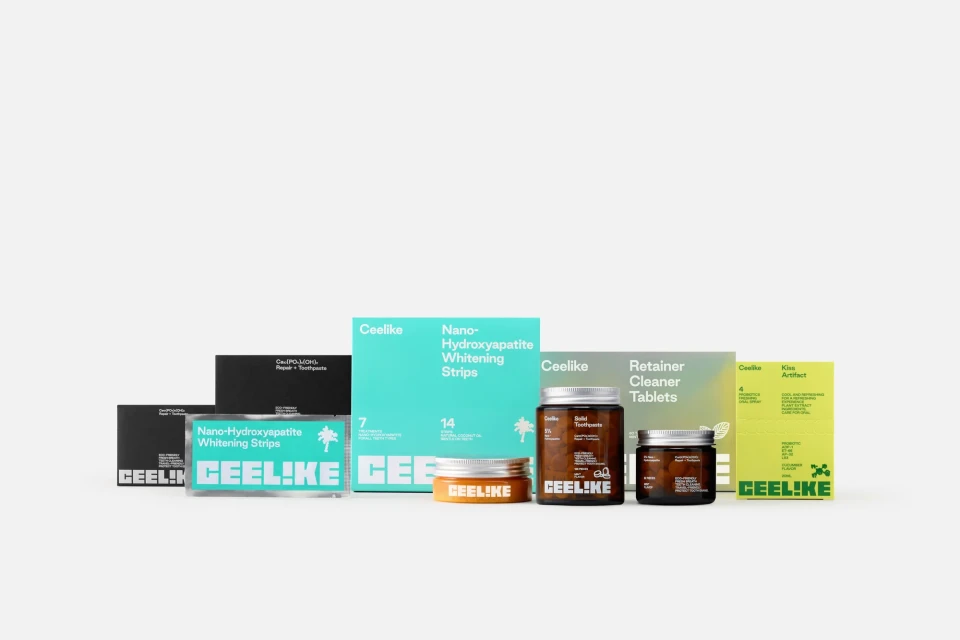
Studioenok leads the brand identity and packaging design for Ceelike, a project that redefines oral care aesthetics through a minimalist, graphic-forward approach. Moving away from traditional dental marketing, the identity utilizes bold typography and a vibrant color palette to anchor the line of toothpaste tablets, oral sprays, and whitening strips. The execution relies on 3D render / CGI techniques and high-contrast motion graphics to showcase the product family. By pairing amber glass jars and turquoise packaging with clean sans-serif letterforms, the project creates a modern, modular visual system that emphasizes the tactile nature of the products.
Style
Horizontal, Commercial, Clean
Background
White Seamless
Context
E-commerce / Product
Associated creatives

5000+ creatives to discover
Sign up to gain access to the entire directory. It’s free.
Visie is a curated library of creative professionals.