
Ceelike breaks oral care conventions Studioenok’s identity for Ceelike breaks oral care conventions 2026
Associated creatives

Tags
Description
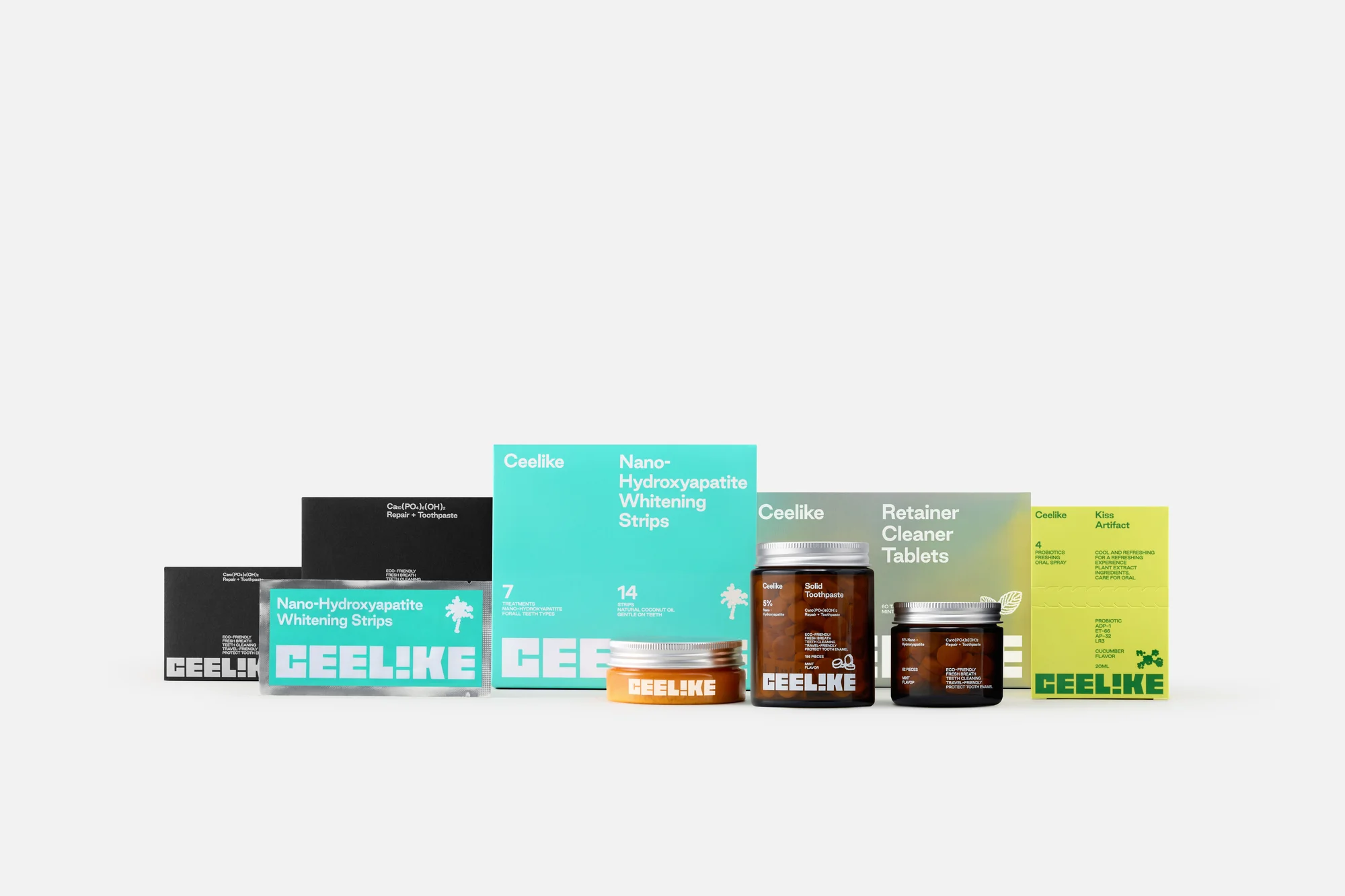
Studioenok's brand identity and packaging design for Ceelike presents a modern line of oral care products arranged against a clean white seamless background. The product family features a variety of containers including amber glass jars with metal lids, rectangular boxes, and foil sachets in a distinctive palette of turquoise, black, olive, and bright yellow. Typography is bold and contemporary, incorporating clean sans-serif letterforms and prominent branding across all items. The composition is structured as a neat horizontal lineup showcasing varying heights and formats. Studioenok created this design to break conventional oral care aesthetics with fresh color pairings and minimalist container forms.
Style
Horizontal, Commercial, Clean, Minimalist
Techniques
3D render / CGI
Industries
CPG / Packaged Food
Color
Background
White Seamless
Context
E-commerce / Product