
Associated creatives

Tags
Description
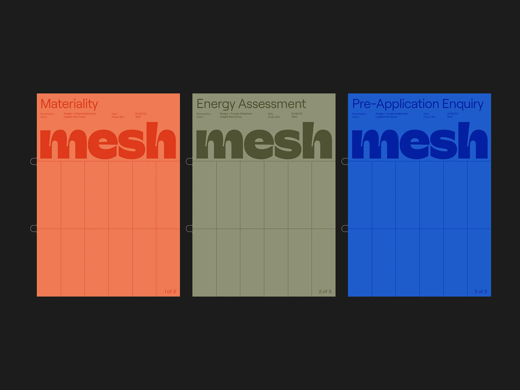
This graphic design project by GIRL showcases a cohesive brand identity for Mesh Architects across three distinct document covers. Each cover utilizes a solid background colour in vibrant orange, muted sage green, and striking blue, structured with fine vertical alignment lines and page numbering indicators. The word mesh is prominently displayed in bold, lowercase typography across the upper center of each layout, accompanied by clean sans-serif secondary text detailing categories such as Materiality, Energy Assessment, and Pre-Application Enquiry. The minimalist compositions are presented side by side against a dark background, highlighting the thoughtful typographic hierarchy and clean grid system.