
Mesh Architects: Brand Identity
Oct 2024
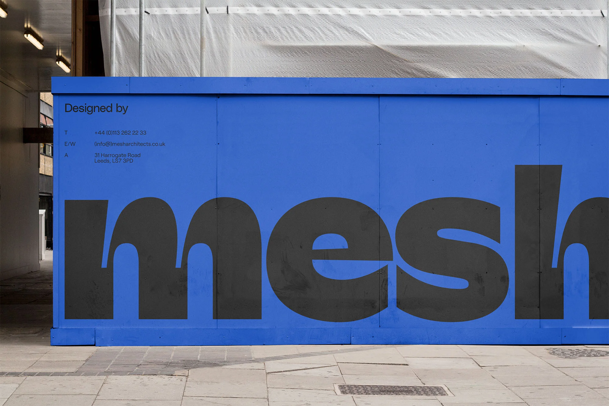
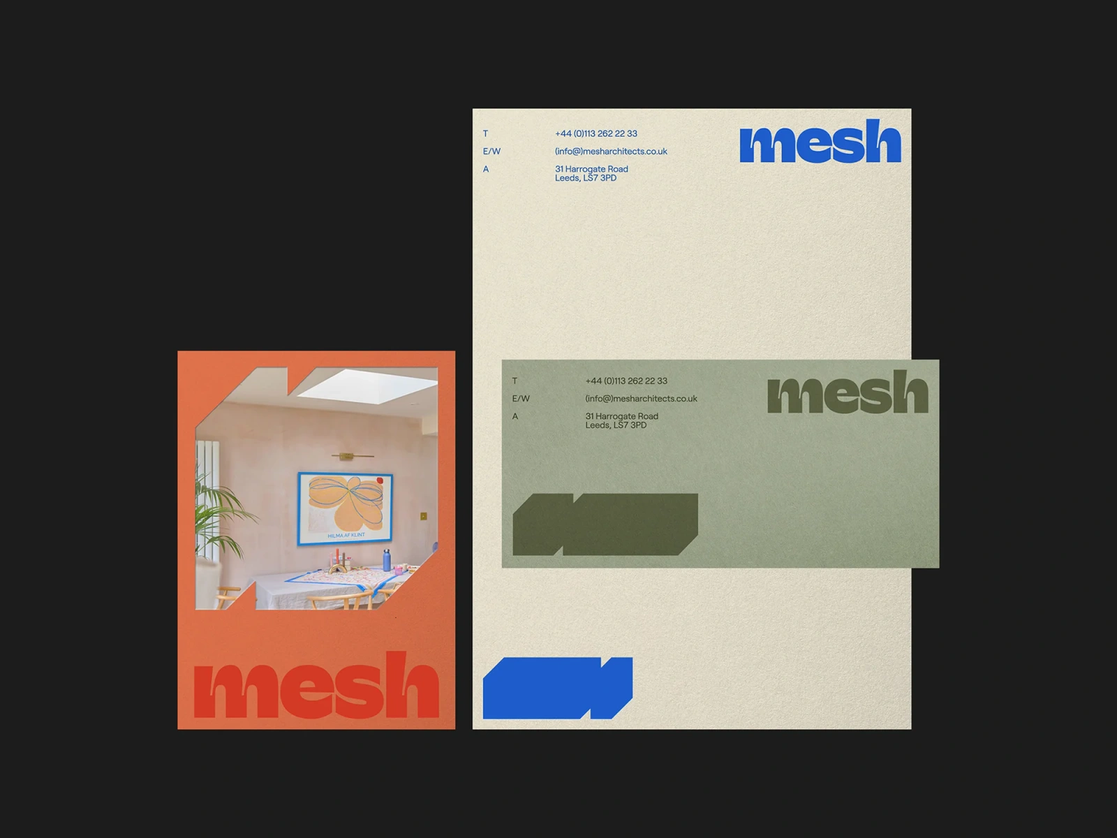
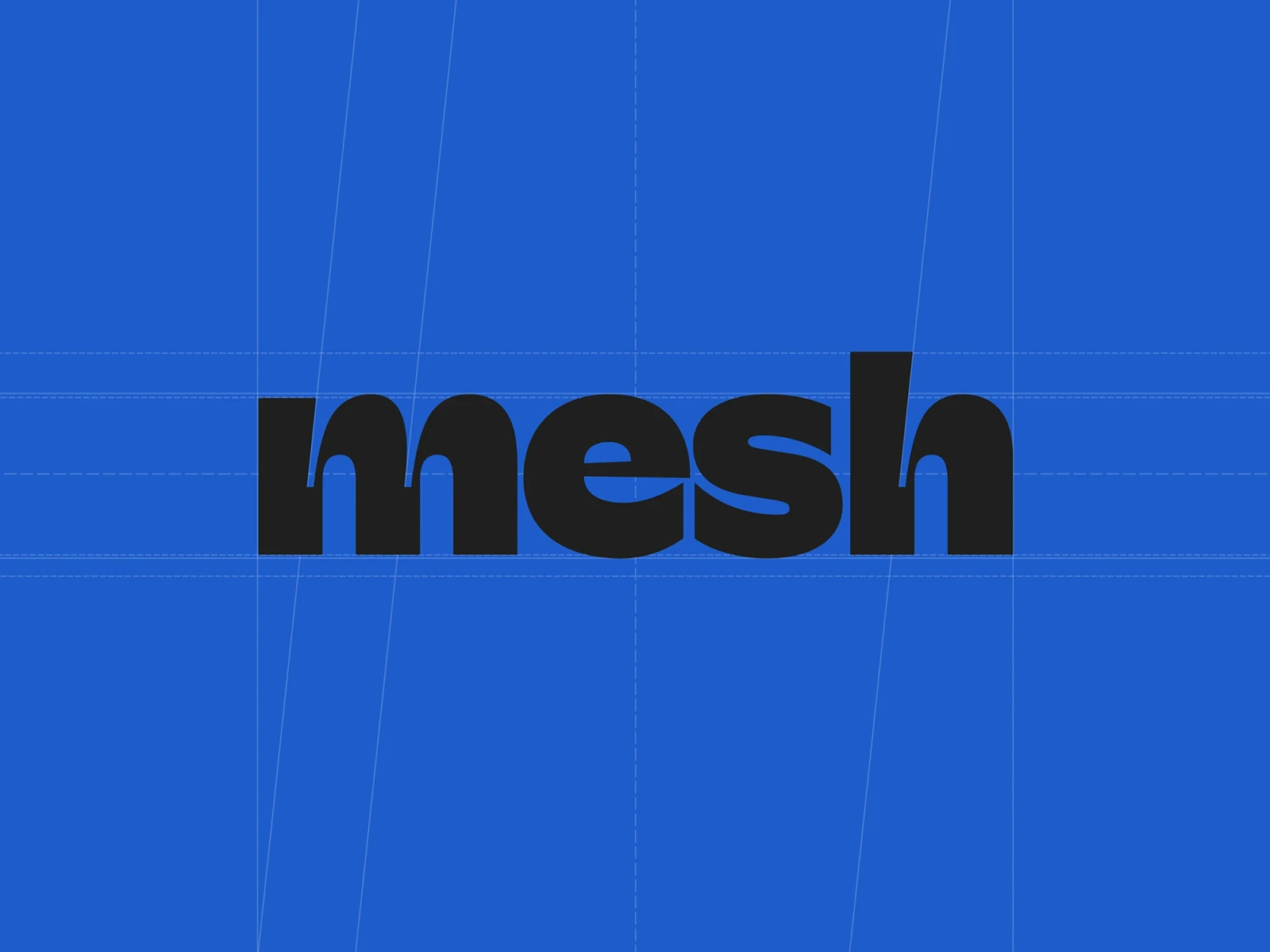
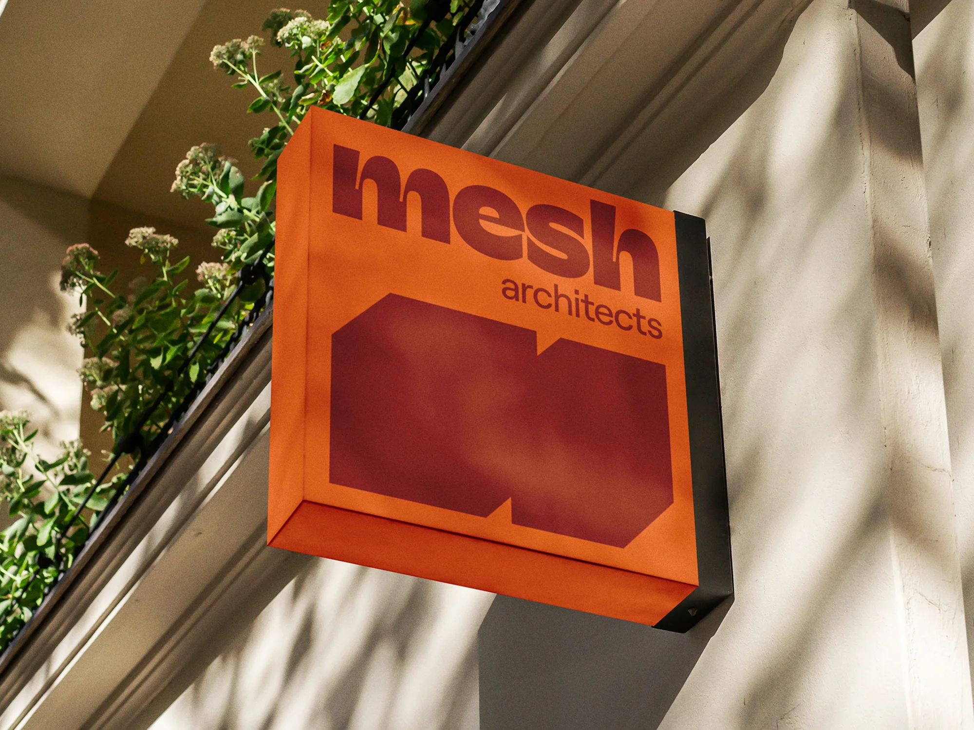
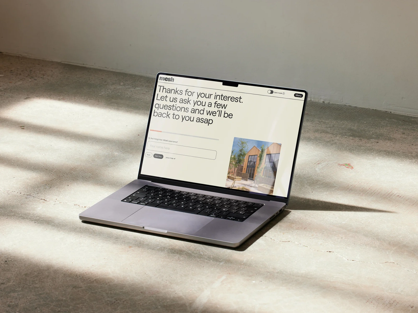
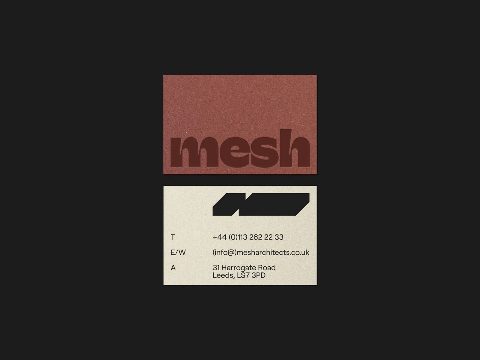
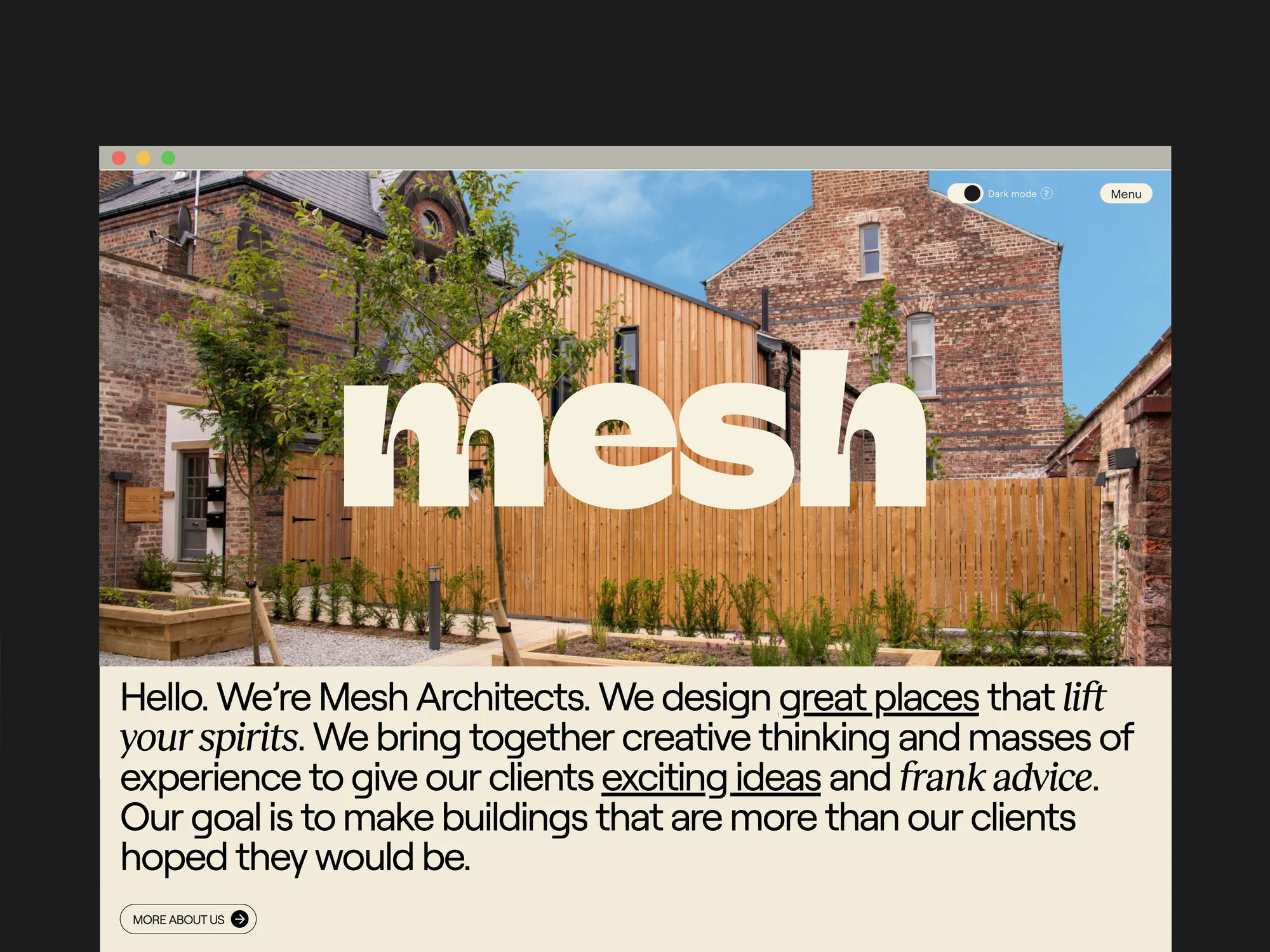
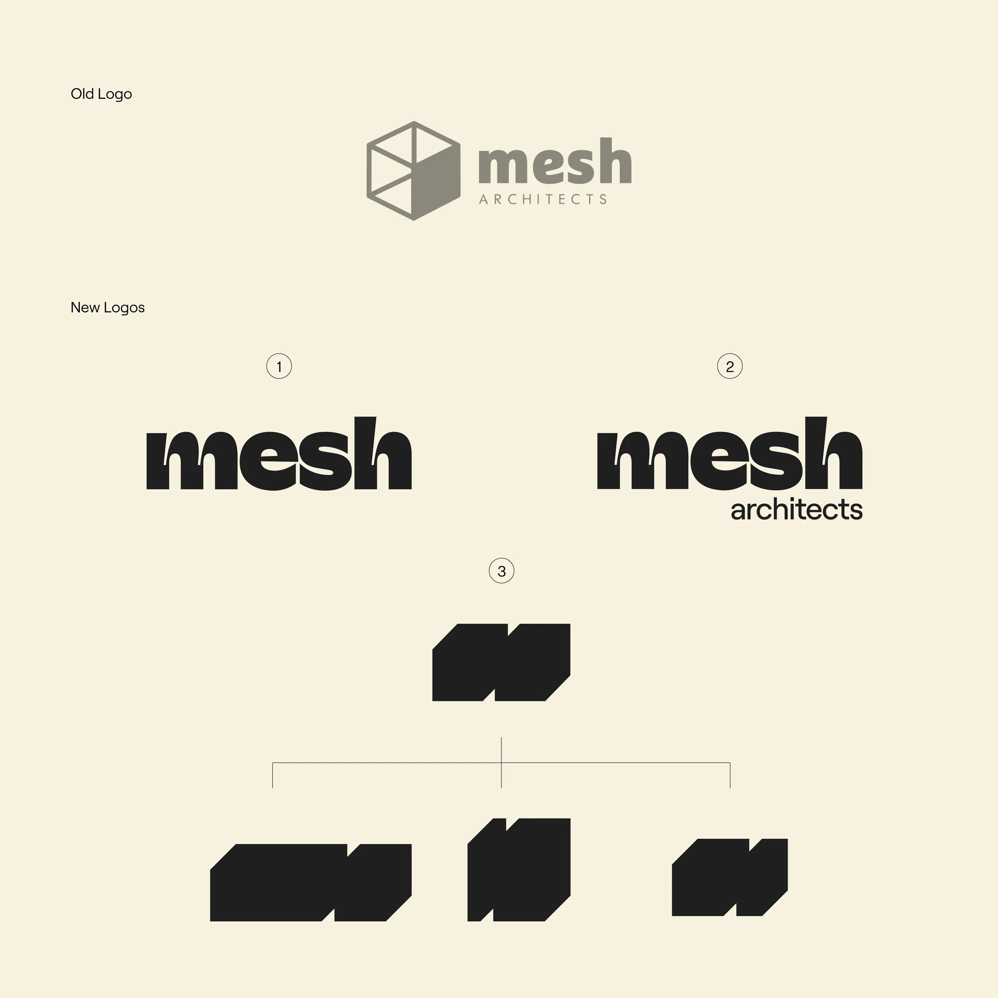
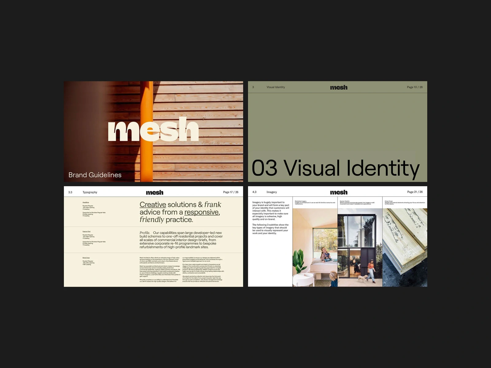
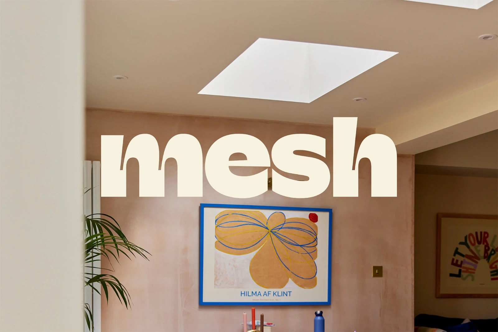
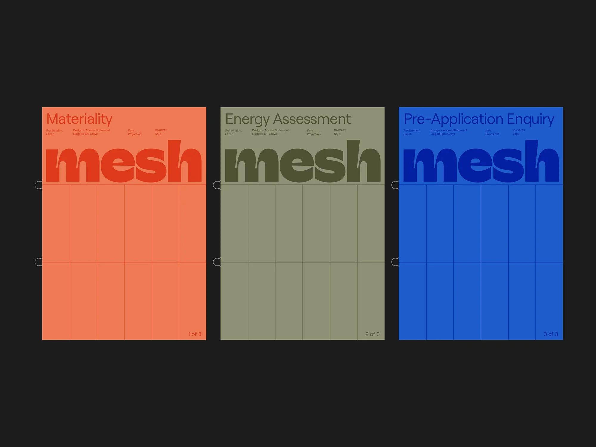
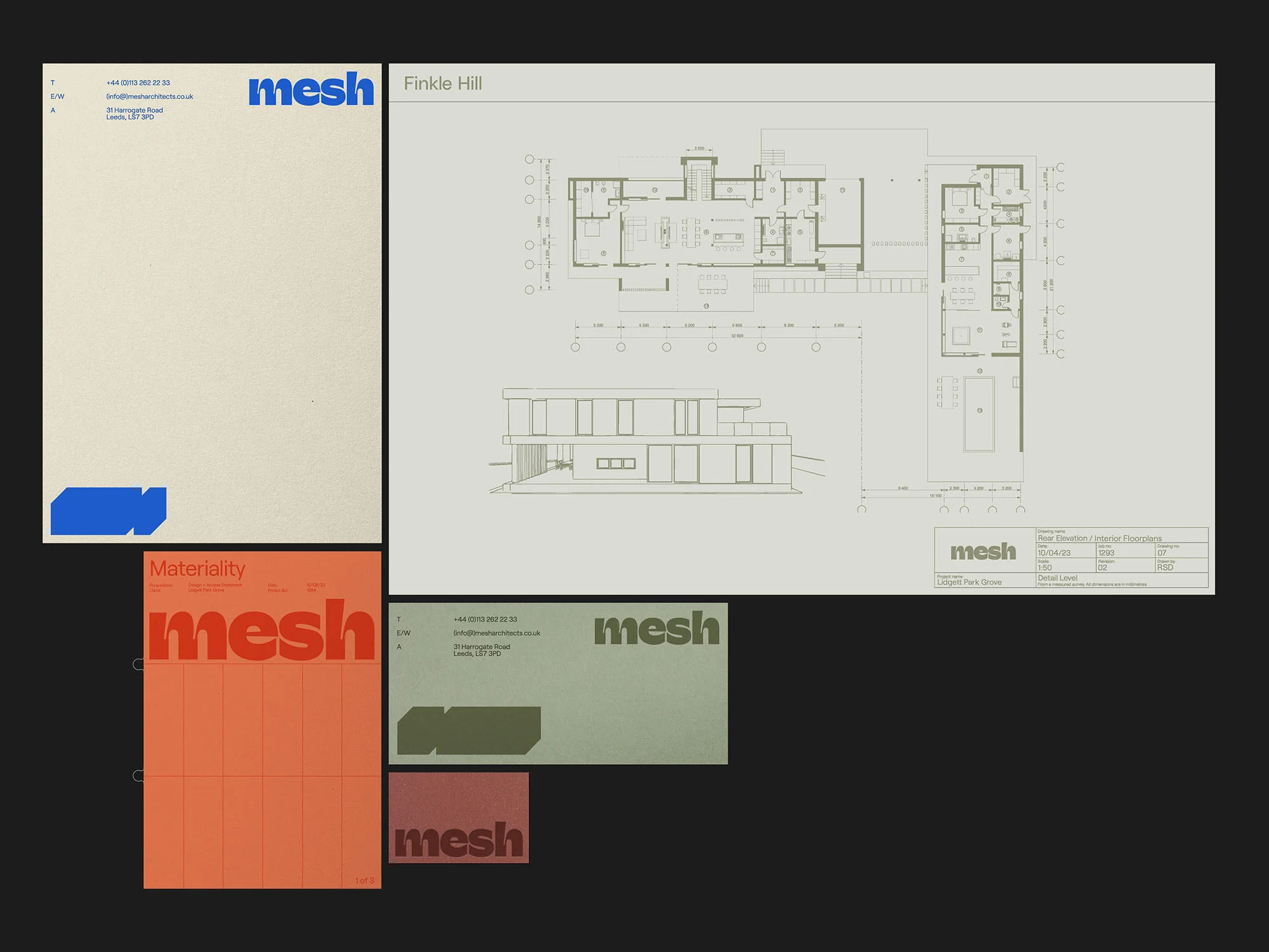
The brand identity for Mesh Architects establishes a cohesive visual language across physical collateral, digital interfaces, and architectural signage. The work leans into a minimalist aesthetic, utilizing bold, lowercase typography and a restrained color palette of terracotta, sage green, and royal blue to convey a modern architectural firm's technical precision. Developed by Visie Admin with graphic design by GIRL, the project incorporates clean grid systems and geometric forms that appear consistently across screen-printed business cards, site hoardings, and a web interface. The identity also extends to internal communication tools, including comprehensive style guidelines and technical document covers, effectively blending graphic design with the practical requirements of architectural practice.
Horizontal, Commercial, Clean
Typography
