
Wide Worlds: Brand Identity
Oct 2024
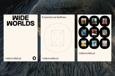
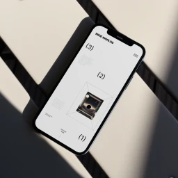
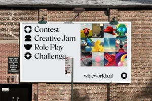
The brand identity for Wide Worlds spans digital and physical touchpoints, unifying a minimalist aesthetic with structured typographic systems. Designed by EAT, the project utilizes a restrained palette of cream, black, and high-contrast layouts to establish a cohesive visual language across screen and print media. The visual system relies on geometric line work and clean composition to organize complex information, including grids and UI-focused elements. Motion graphics incorporate fluid, kinetic typography to enhance the brand's digital presence, while outdoor executions translate these design principles into large-scale formats. The work is supported by documentary-style imagery that anchors the brand in expansive, outdoor settings.
Horizontal, Commercial, Minimalist
Brand Film / Corporate Video
