
Two Days: Brand Identity
Brand
Date
Oct 2020
Description
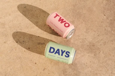
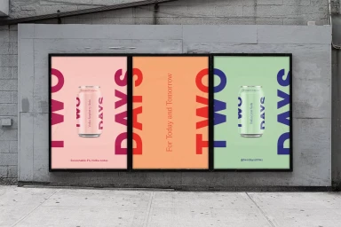
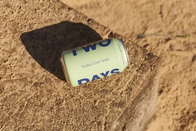
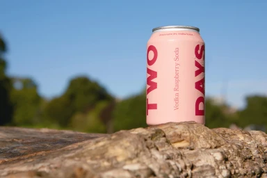
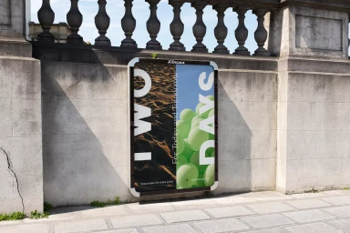
The brand identity for Two Days, developed by Studio Thomas, centres on a clean, minimalist graphic approach for the beverage company. The work integrates bold typography with vibrant pastel colour palettes, applied across product packaging and public-facing advertising materials. The visual execution relies on natural light and tactile, earthy settings to ground the brand. Imagery captures the cans against weathered stone, wood, and concrete textures, using sharp shadows and 3D render techniques to present a polished, commercial aesthetic.
Style
Horizontal, Commercial, Clean
Techniques
Natural light
Associated creatives

5000+ creatives to discover
Sign up to gain access to the entire directory. It’s free.
Visie is a curated library of creative professionals.