
Tom Król: Brand Identity
Mar 2021
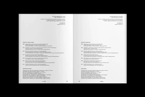
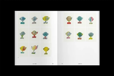
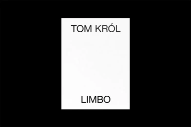
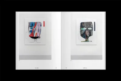
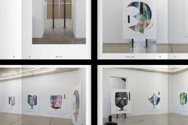
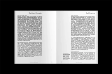
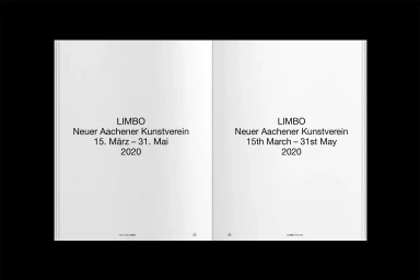
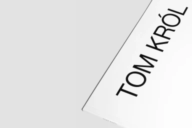
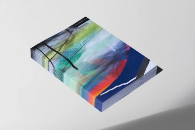
The brand identity for artist Tom Król is defined by a rigorous approach to editorial typography and minimalist print production. Developed as a comprehensive visual language for art catalogs and exhibition documentation, the system utilizes bilingual layouts and grid-based structures to frame Król’s expressive, figurative work. Graphic design by Ken Hegemann emphasizes a monochromatic palette and clean sans-serif type, creating a structured contrast against the vibrant textures of the artwork. The presentation spans various formats, from stitched booklets to gallery prints, utilizing specialized paper stocks and screen print techniques to enhance the tactile quality of the finished publications.
Horizontal, Clean, Minimalist
Typography
Editorial


