- Home
- ·Projects
- ·Peter Zizka
- ·2019
- ·Brand Identity





Peter Zizka Brand Identity 2019
About
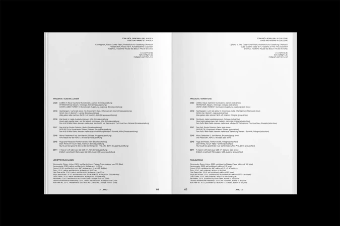
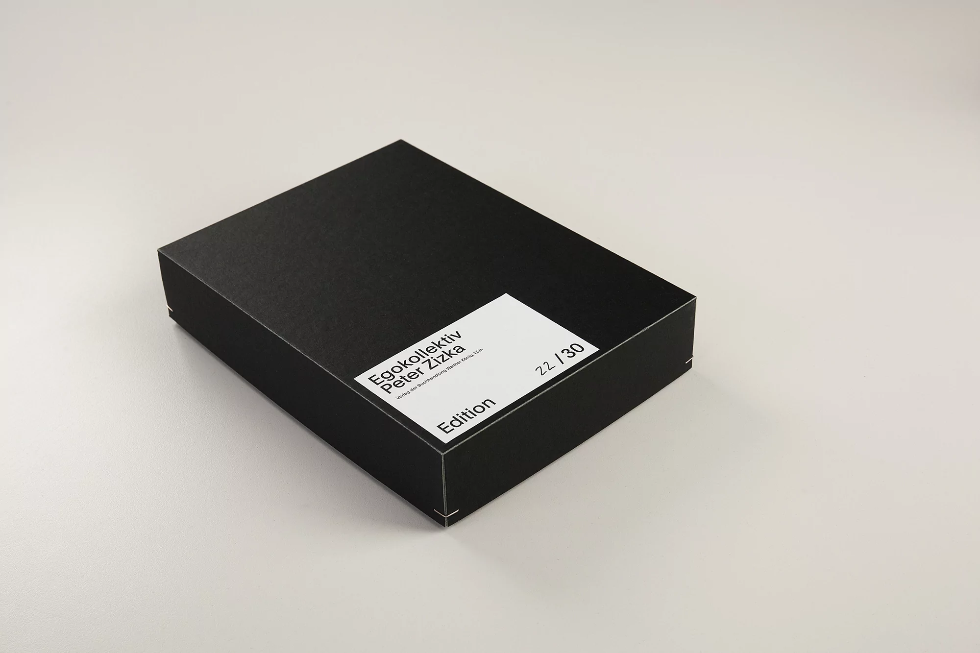
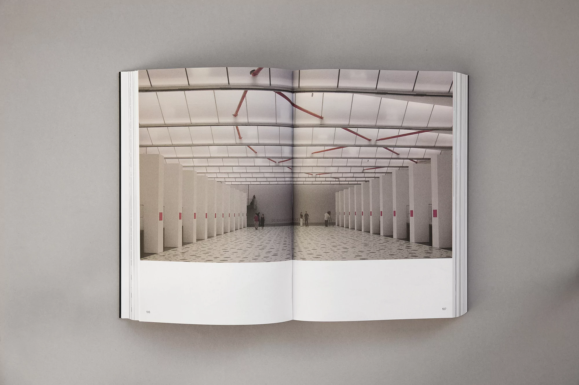
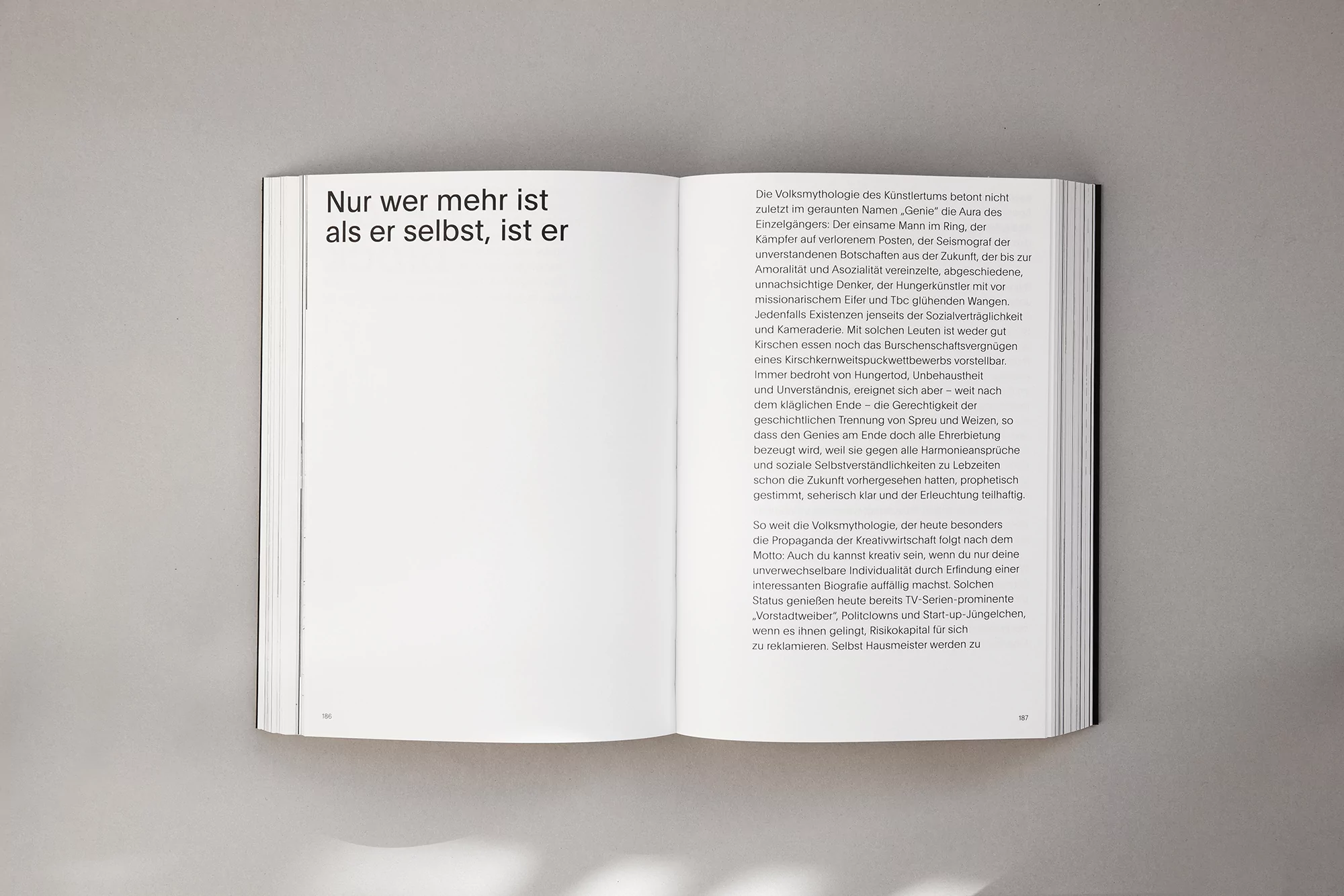
The brand identity for Egokollektiv, spearheaded by Peter Zizka with graphic design by Ken Hegemann, stands as a masterclass in editorial minimalism. Operating within the intersection of digital media and corporate design, the project manifests as a sophisticated physical manifestation of brand storytelling through high-end publication. The execution relies heavily on a restrained, monochromatic palette, allowing the stark interplay of bold black sans-serif typography against crisp white negative space to drive the visual narrative. The project expertly utilizes natural light to emphasize the structural geometry of the collateral, ranging from limited-edition matte black boxes to hardbound volumes. Through a series of clean, top-down studio shots, the work leans into a refined grid system that feels both modern and timeless. Technique-wise, the inclusion of cinematic, live-action photography within the editorial layouts introduces a layer of narrative depth, grounding the abstract typographic design in a tangible, atmospheric reality. The result is a highly tactile brand identity that balances technical precision with artistic intent. By prioritizing legible hierarchy and intentional fragmentation, the design achieves a level of graphic clarity that is essential for contemporary corporate identity work, effectively transforming dense, German-language content into an elegant, highly structured brand experience that feels both authoritative and approachable for a high-end audience.