Logo
Graphic design layout featuring dark background, atmospheric scene image, white typography, and bold red diagonal text.
Exhibition postcards featuring collage art of two figures arranged on a bed of promotional print collateral for TO Live
Pink poster reading Making Space mounted on a glass storefront facade with decorative framing
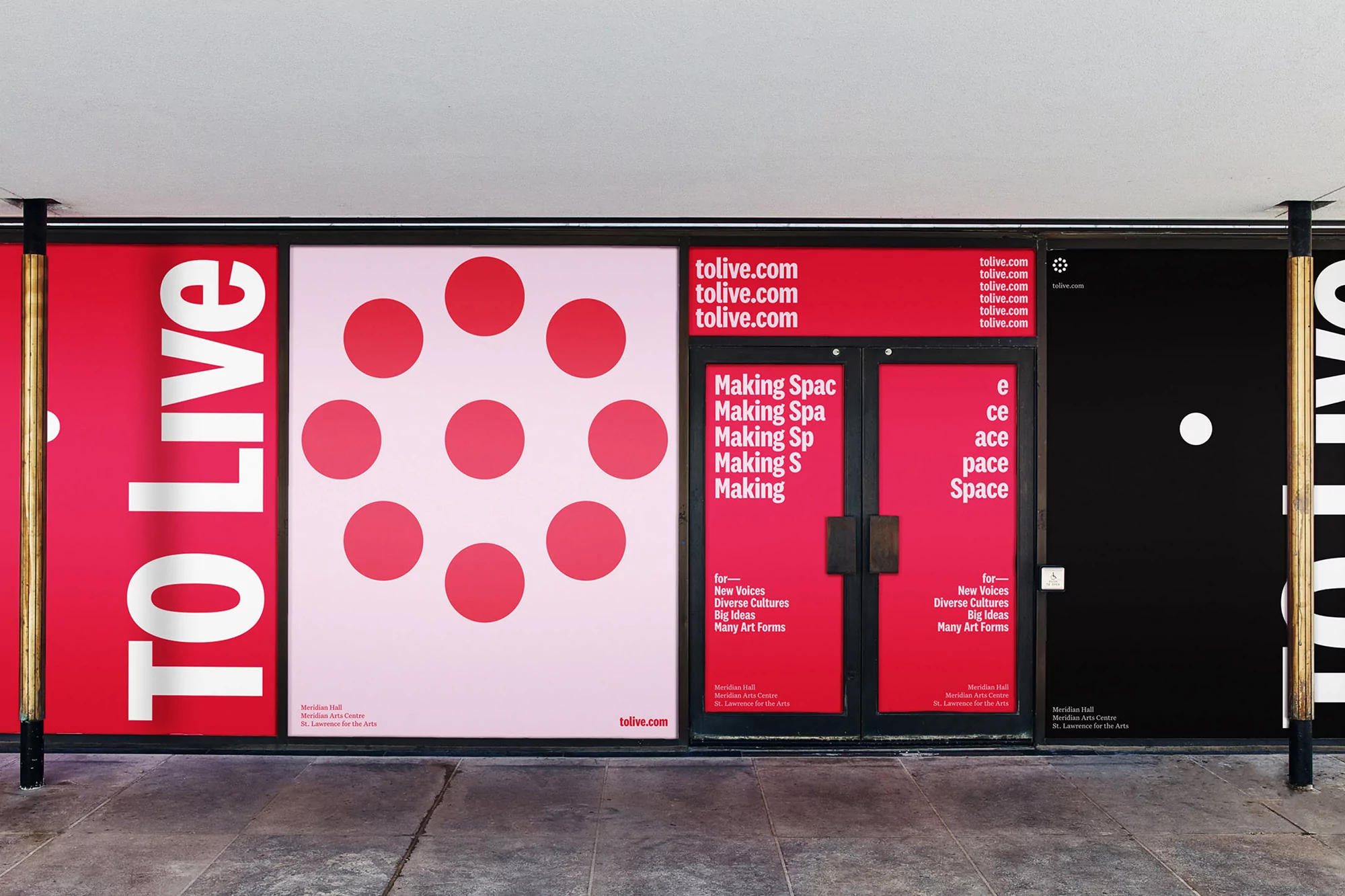
TO Live building exterior with bold red and pink brand identity signage, graphic dot patterns, and large typography.
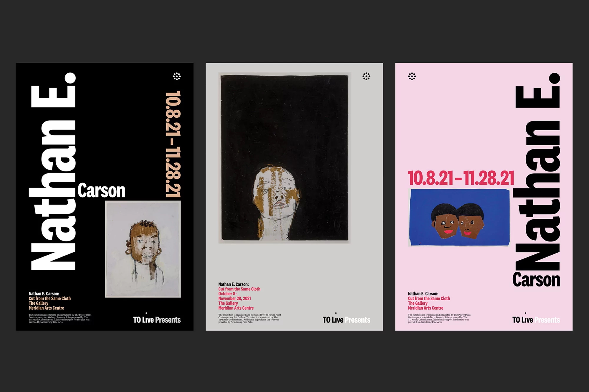
Three exhibition posters for Nathan E. Carson featuring bold typography and figurative artworks on black, grey, and pink backgrounds.
Graphic design layout featuring dark background, atmospheric scene image, white typography, and bold red diagonal text.
Exhibition postcards featuring collage art of two figures arranged on a bed of promotional print collateral for TO Live
Pink poster reading Making Space mounted on a glass storefront facade with decorative framing

TO Live Brand Identity 2021

About

Underline Studio developed a cohesive brand identity for TO Live, a project that spans extensive print collateral, urban installations, and motion graphics. The design system utilizes a structured grid and minimalist aesthetic, relying on high-contrast color blocking and bold typography to establish a distinct visual language for cultural programming. The visual approach integrates graphic design with atmospheric photography by Daniel Ehrenworth and Paul Weeks. The execution incorporates tactile collage artwork by Nathan E. Carson and dynamic motion graphics that emphasize geometric patterns and layered text. Across storefront applications and promotional exhibition materials, the identity maintains a clean, modern quality through the use of consistent sans-serif typefaces and primary color palettes.

Brand

Credits

Styles

5000+ creatives to discover

Sign up to gain access to the entire directory. It’s free.

Visie is a curated library of creative professionals.
Trusted by