
TMPL: Brand Identity

Aug 2020
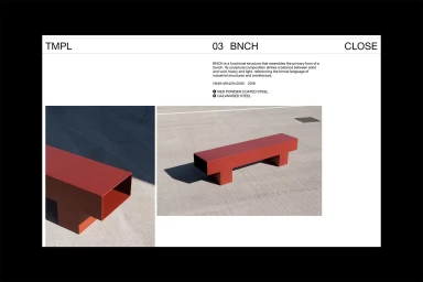
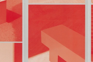
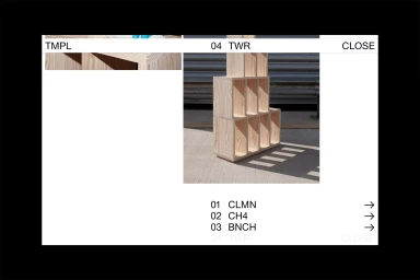
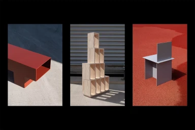
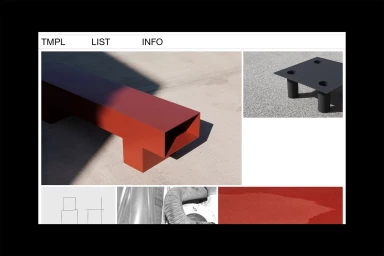
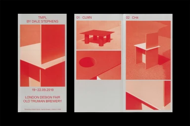
The brand identity for TMPL, crafted by Studio FAX, serves as a masterclass in industrial minimalism and structural precision. This cohesive project manifests a rigorous commitment to material honesty, grounding its visual language in the interplay between vibrant, powder-coated steel forms and the raw texture of concrete. Through a series of commercial and corporate design applications, the identity leverages clean typography and a strategic, high-contrast palette of bold reds and muted, industrial greys. The execution spans digital and physical collateral, from trifold brochures and business cards to modular web interfaces, all tied together by a systematic grid structure. Anna Garforth captures these furniture pieces with architectural clarity, utilizing sharp, natural light to highlight the interplay of solid and void that defines the brand. Felix Steindl provides the necessary technical architecture to translate these sculptural elements into a refined digital experience. The project leans into an editorial aesthetic that celebrates modularity, ensuring that whether presented as a technical catalog or as display work for the London Design Fair, the brand identity remains unmistakably intentional. By synthesizing abstract geometric motifs with technical infographics, the identity transforms functional, minimalist furniture into pieces of sculpture, successfully navigating the intersection of high-end product design and clear, utilitarian graphic communication.
Horizontal, Clean, Minimalist
Typography
White Seamless


