
GREYHEADS: Brand Identity

Aug 2020
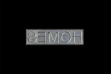
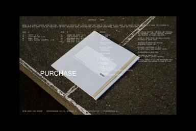
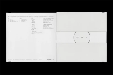
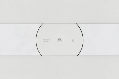
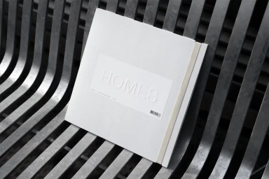
The brand identity for GREYHEADS, meticulously crafted by the design team at Studio FAX, represents a masterclass in restrained, high-end design aesthetics. This project channels a distinctly industrial yet clinical sensibility, leveraging the power of negative space and precise typographic hierarchies to establish a cohesive visual language. By moving beyond traditional branding, the work leans into an editorial minimalism that feels both tactile and modern, best exemplified by the strategic use of emboss and deboss techniques on paper stocks and metal surfaces. The visual narrative relies heavily on high-contrast studio photography, where the starkness of deep black backgrounds frames the clean, monochromatic palettes of the physical assets. Whether through the functional layout of vinyl record packaging or the textured presence of embossed book covers, the identity project functions as a study in material interplay, contrasting the smooth, reflective qualities of brushed metal against the raw, gritty surfaces of concrete and paper. Every element, from the monospaced typography to the symmetrical composition, reflects a commitment to functional clarity. By emphasizing these structural details and maintaining a consistent, professional design language, the branding achieves a timeless quality that feels deliberate and thoroughly considered. This project serves as a clear articulation of how corporate identity can successfully occupy the space between artistic expression and commercial precision.
Horizontal, Commercial, Clean, Minimalist
Typography
Advertising Campaign
