
TimeMoto: Brand Identity
Brand
Date
Nov 2022
Description
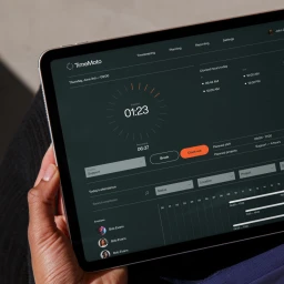
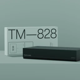
TimeMoto presents a refreshed brand identity for its suite of time-tracking hardware and apps, focusing on clarity through a minimalist aesthetic. The project establishes a cohesive visual language characterized by structured information grids, modern typography, and a refined color palette of pastels and neutral tones. The execution bridges digital and physical touchpoints, incorporating motion graphics and 3D render/CGI elements to demonstrate product functionality. With graphic design led by Resoluut and photography by Lonneke van der Palen, the campaign spans tablet interfaces, urban advertising, and studio product captures.
Style
Horizontal, Commercial, Clean, Minimalist
Industries
Color
Jet Black
Pure White
Associated creatives


5000+ creatives to discover
Sign up to gain access to the entire directory. It’s free.
Visie is a curated library of creative professionals.