
The Faversham
Brand Identity
Aug 2017
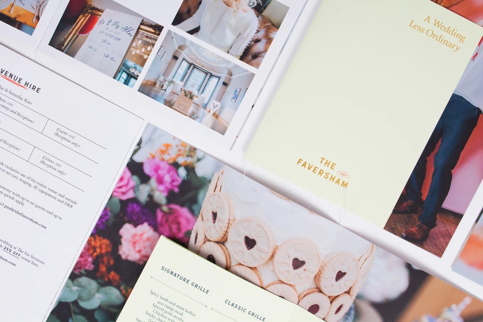
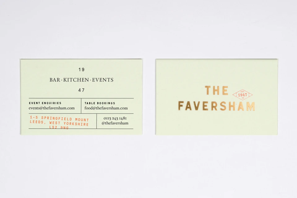
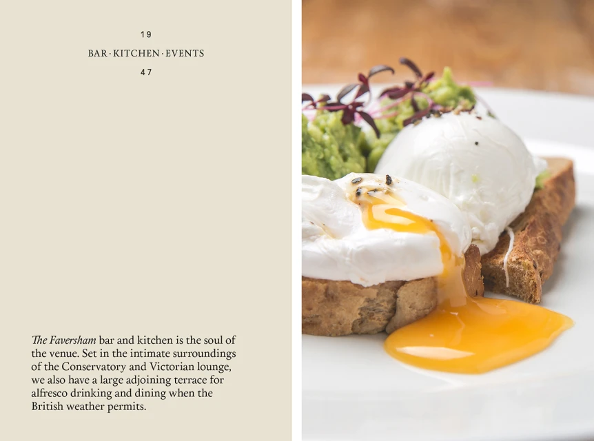
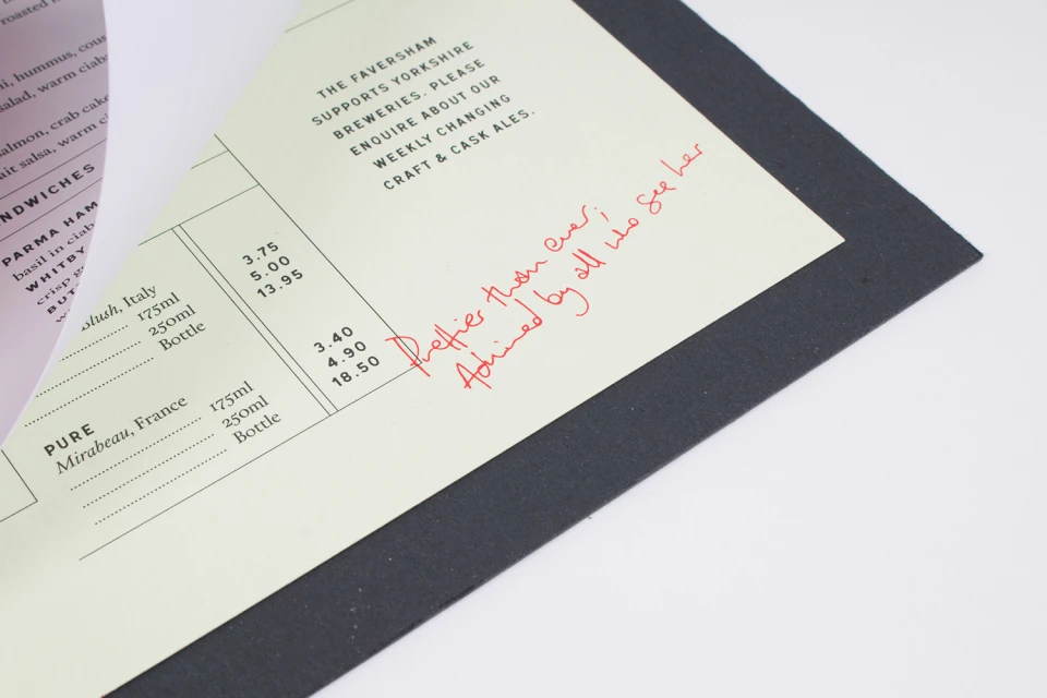
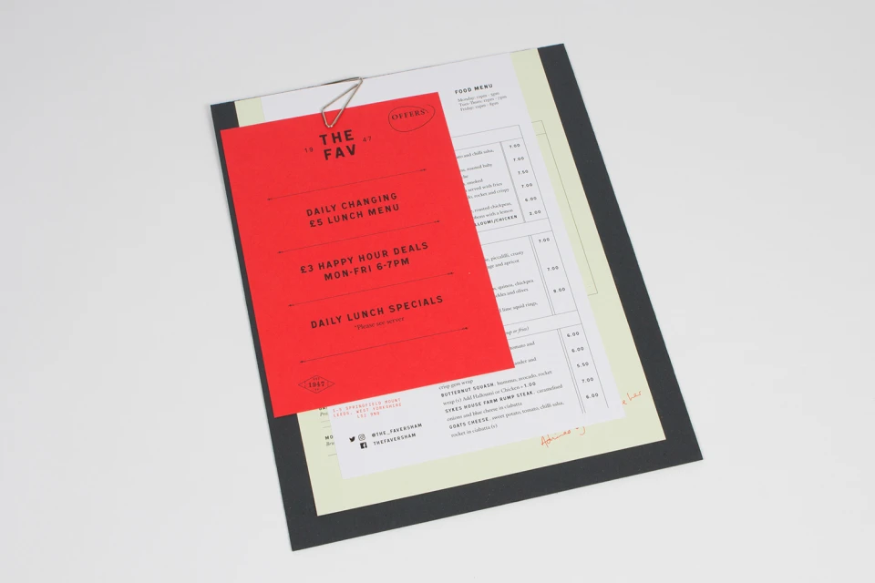
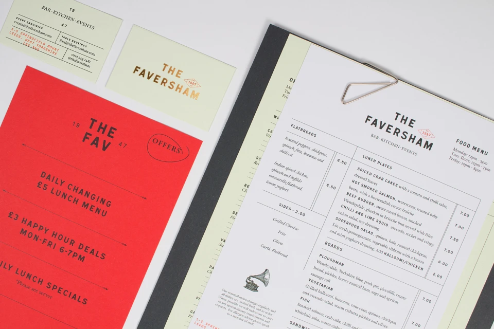
The brand identity for The Faversham, masterfully executed by the design team at Passport, represents a sophisticated fusion of heritage and contemporary hospitality. Within the competitive restaurants and food and beverage sector, the project establishes a cohesive visual language that balances the gravitas of a 1947 legacy with a sharp, modern sensibility. The design strategy leans into a refined commercial aesthetic, utilizing a restrained palette of pale green, crisp white, and bold red accents to organize a diverse array of collateral. Through meticulous typography choices—interweaving classic serif headers with clean, functional sans-serif grids—the identity manages the dual demand of event planning documentation and daily menu navigation. The tactile quality of the materials is emphasized through the use of premium paper stocks and metallic gold foil detailing, which grounds the brand in an atmosphere of approachable luxury. High-quality macro food photography captures the textures of the kitchen’s output, while the integration of natural light in product shots highlights a clean, professional finish. By layering functional elements like metal clips and handwritten annotations against structured layouts, Passport has crafted a system that feels both authentic and highly organized, ensuring that every touchpoint from business cards to lunch menus reinforces a singular, enduring narrative of professional excellence and culinary clarity.
Horizontal, Commercial, Clean, Minimalist
Typography
Restaurants
White Seamless
Website / Web
