Logo
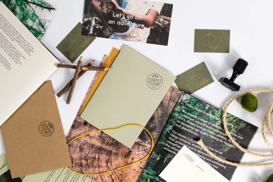
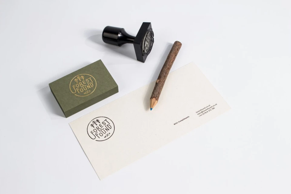
Flatlay of Forest Found brand identity stationery featuring olive green cards, brown envelopes, twig pencils, and a stamp on a white surface
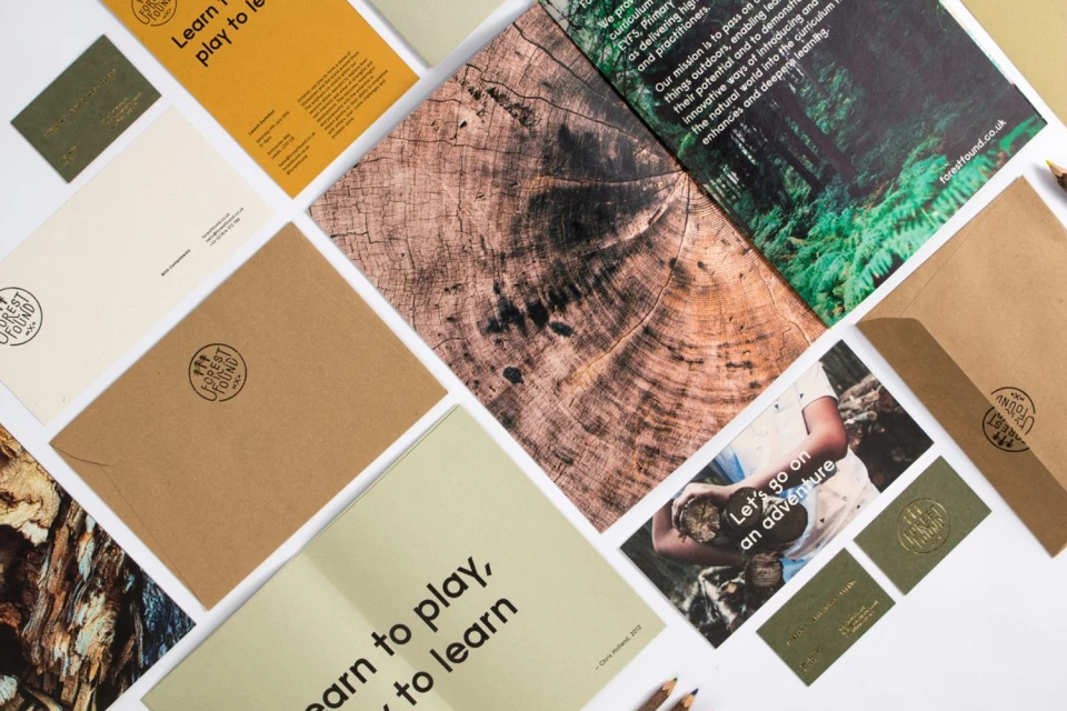
Flat lay of Forest Found brand identity stationery, kraft envelopes, and brochures on a white surface.
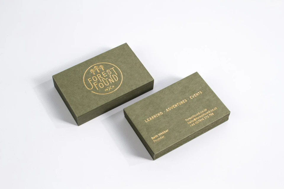
Two olive green business cards with gold foil stamping displayed on a clean white background.
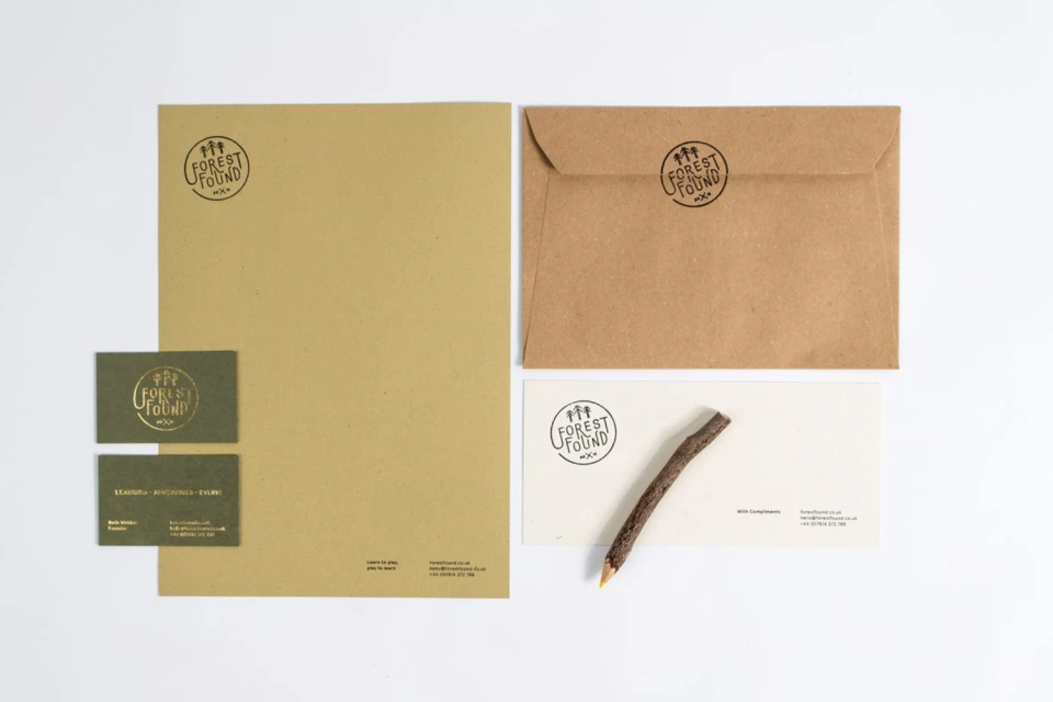
Branding stationery mockup featuring Forest Found logo on kraft paper letterhead, envelopes, business cards, and a twig pencil.
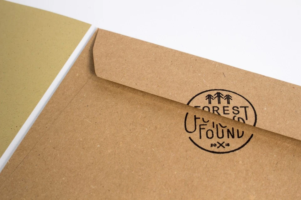
Kraft paper envelope with a black circular Forest Found logo stamp resting on a white surface.
Branding mockup featuring an olive green business card, cream envelope, black stamp, and twig pencil on white background.
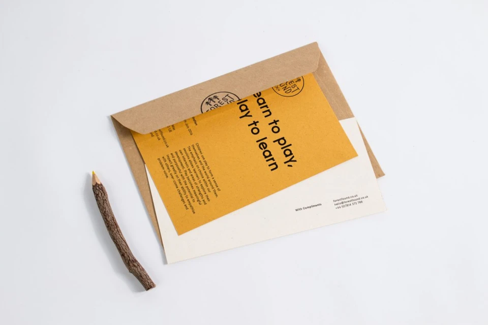
Craft paper envelope with a yellow insert card and a wooden twig pencil on a clean white surface
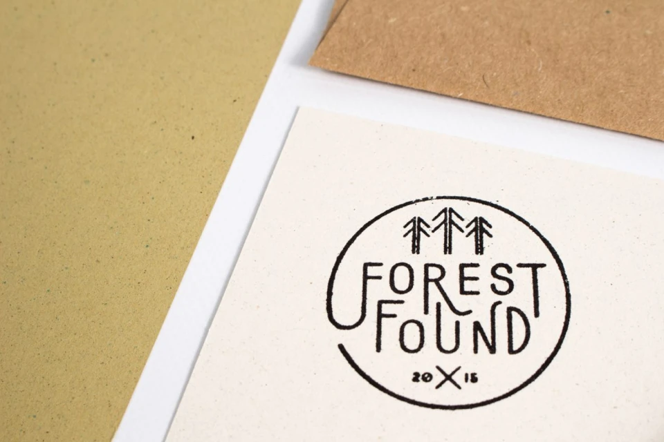
Close up overhead shot of Forest Found brand identity stationary with a stamped tree logo on textured white paper.
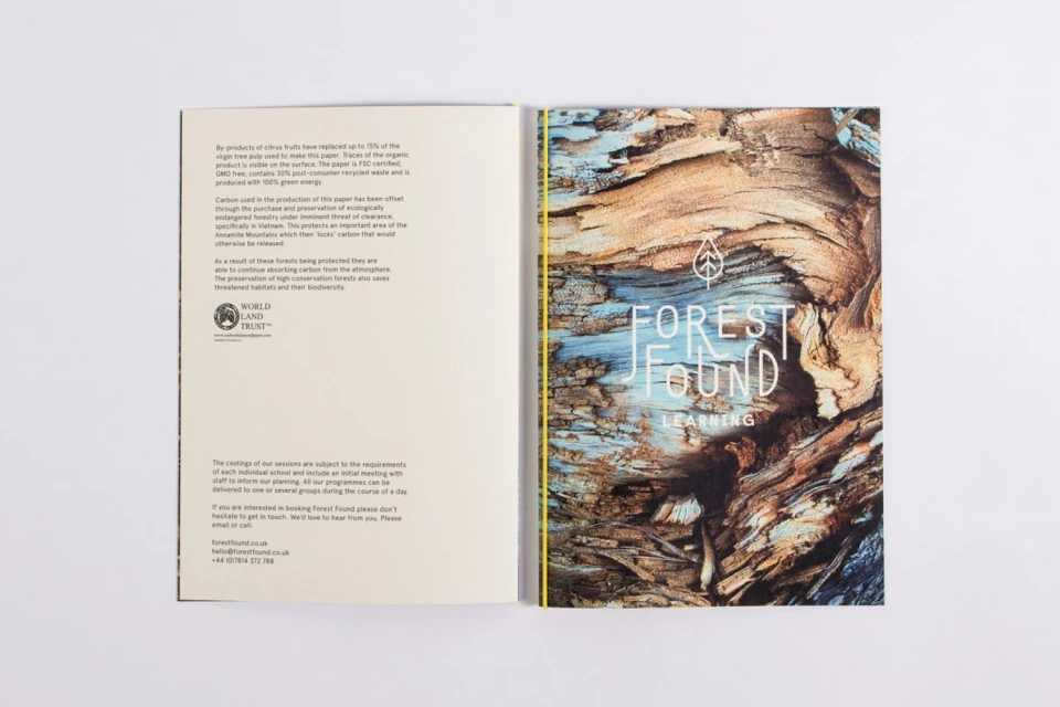
Open brochure for Forest Found with text page on left and detailed tree bark graphic on right against white background
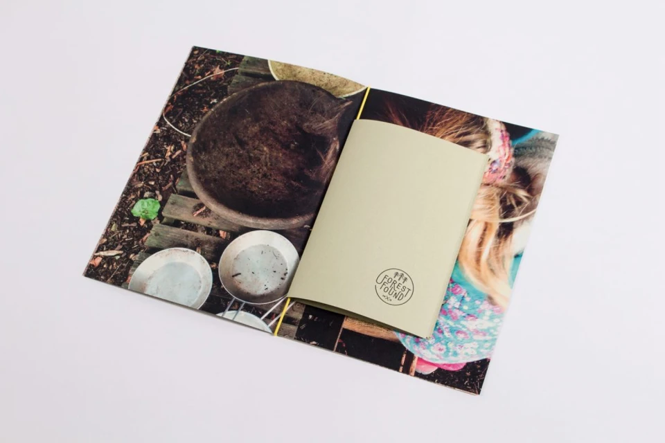
Open brochure for Forest Found displaying interior photography and a sage green insert against a white background
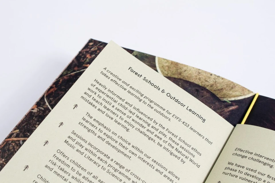
Close-up of an open printed booklet displaying typographic text on cream paper against a plain white background
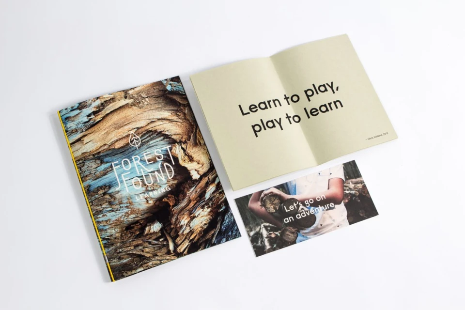
Printed booklet, open book with typography, and postcard laid out on a white surface.
Flatlay of Forest Found brand identity stationery featuring olive green cards, brown envelopes, twig pencils, and a stamp on a white surface
Flat lay of Forest Found brand identity stationery, kraft envelopes, and brochures on a white surface.
Two olive green business cards with gold foil stamping displayed on a clean white background.

Forest Found Brand Identity 2016

About

The brand identity for Forest Found serves as a masterclass in tactile, nature-focused design, effectively bridging the gap between professional corporate responsibility and the raw, organic aesthetic of outdoor education. Executed with precision by Passport, the project leans into a minimalist design philosophy that favors texture and materiality to tell the brand story. Throughout the series of commercial flat lays, the identity is brought to life using a deliberate palette of sage green, mustard yellow, and earth-toned kraft paper, which provides a grounding contrast to the stark white studio backgrounds. The design language is consistent and thoughtful, utilizing high-quality typography that seamlessly overlays imagery of weathered tree bark and forest landscapes. The inclusion of bespoke elements, such as pencils with bark-like casings and custom rubber-stamped collateral, elevates the stationery beyond standard corporate materials, imbuing the brand with an artisan, tactile quality. By leveraging studio strobe lighting, the photography emphasizes the deliberate grain of the paper stocks and the premium depth of gold foil stamping, capturing a sense of authenticity. This cohesive visual system perfectly encapsulates the brand ethos of learning through nature, balancing technical information with evocative, high-resolution imagery. Ultimately, the project demonstrates how deliberate graphic design can transform simple print materials into a cohesive, immersive experience that honors the natural world while maintaining a sharp, modern corporate edge.
Brand

Credits

Styles

Techniques

5000+ profiles to discover

Sign up to gain access to the entire directory. It’s free.

Visie is a curated library of creative professionals.
Trusted by