
The European Review of Books
Brand Identity



Apr 2021
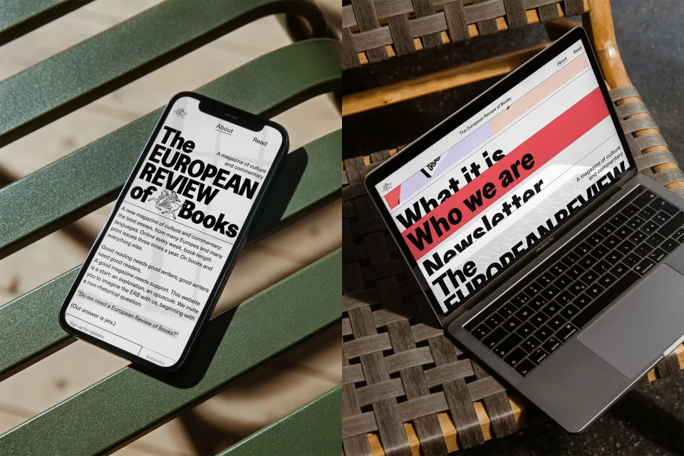
The brand identity for The European Review of Books establishes a visual language that bridges print-inspired editorial aesthetics with modern digital publishing. Designed by Bakken & Bæck, the identity utilizes bold typography and a distinct palette of coral-red illustrations against minimalist, pale backgrounds. The project leans into artistic graphic design and motion graphics to create a cohesive experience across print and digital platforms. The responsive digital interface, developed by Alejandro V. Rojas, translates these clean, print-driven motifs into functional web and mobile layouts. The overall execution highlights a focus on typography and motion graphics to maintain character across varied screen sizes and promotional materials.
Horizontal, Commercial
Digital Media & Publishers

