
The Atlantic
Brand Identity

Sep 2026
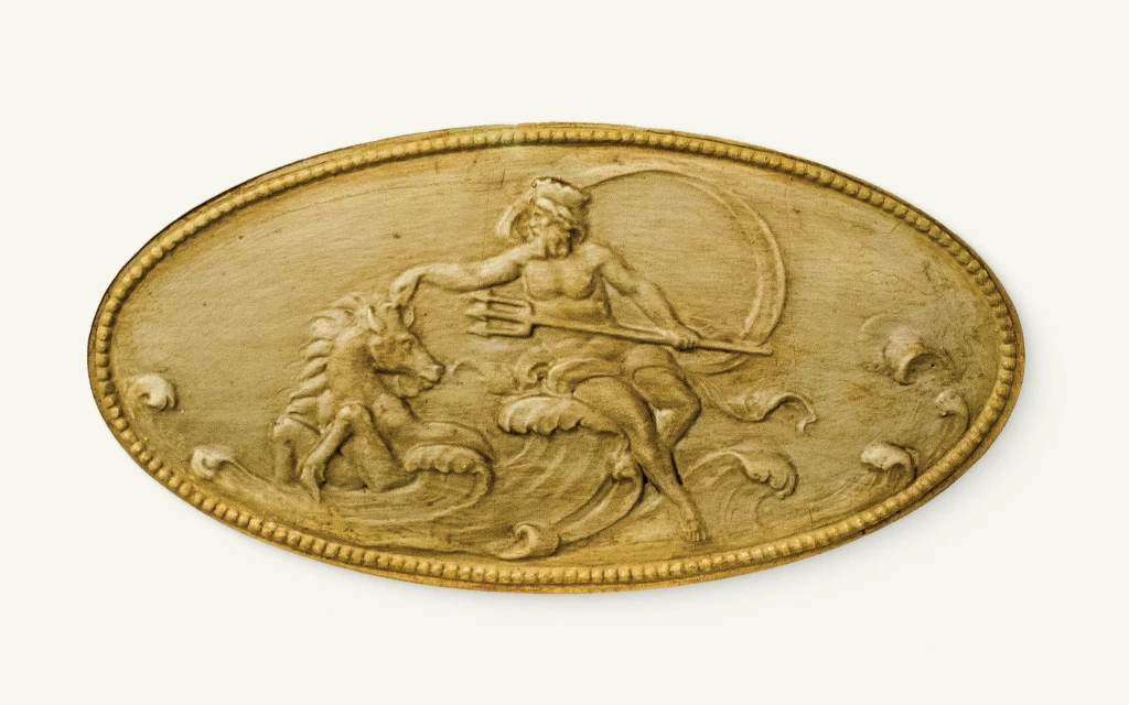
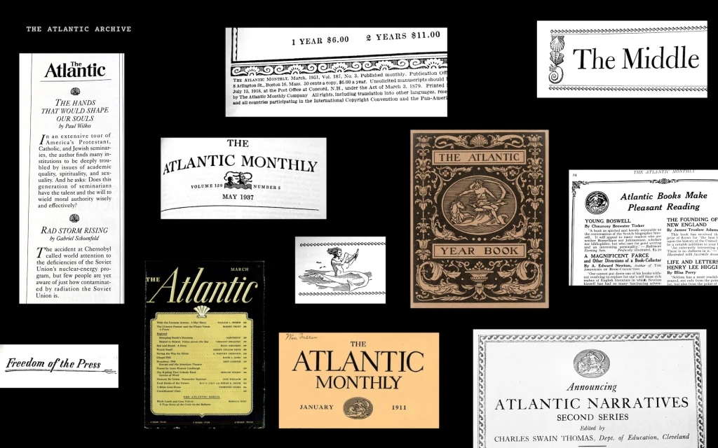
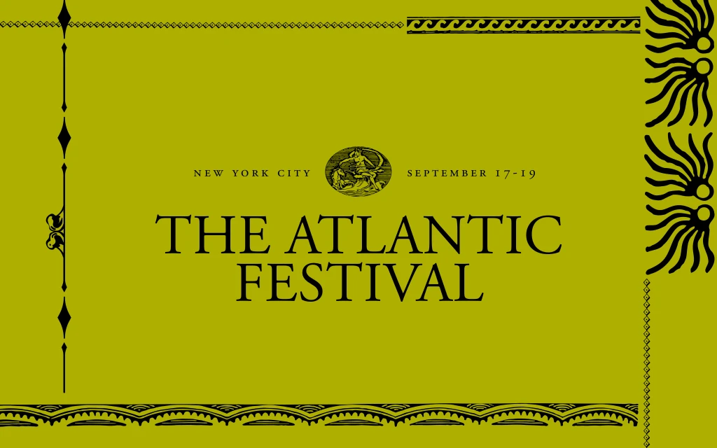
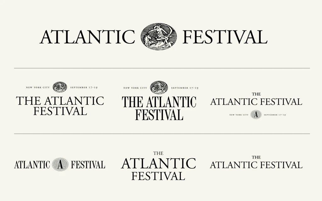
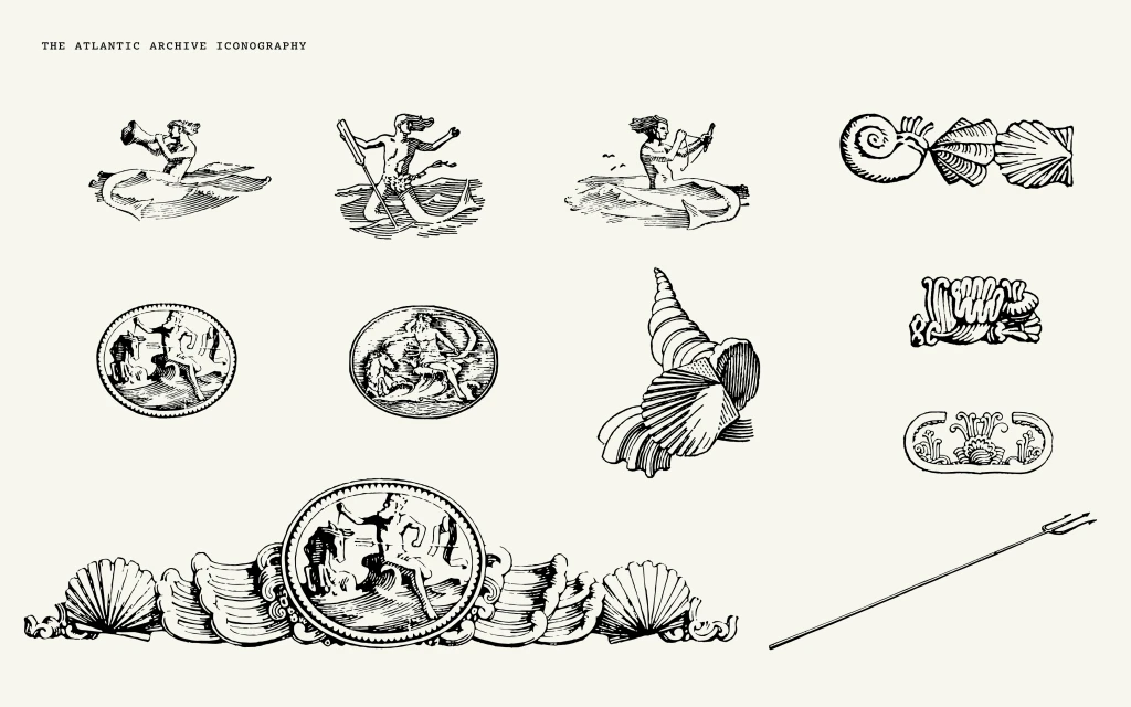
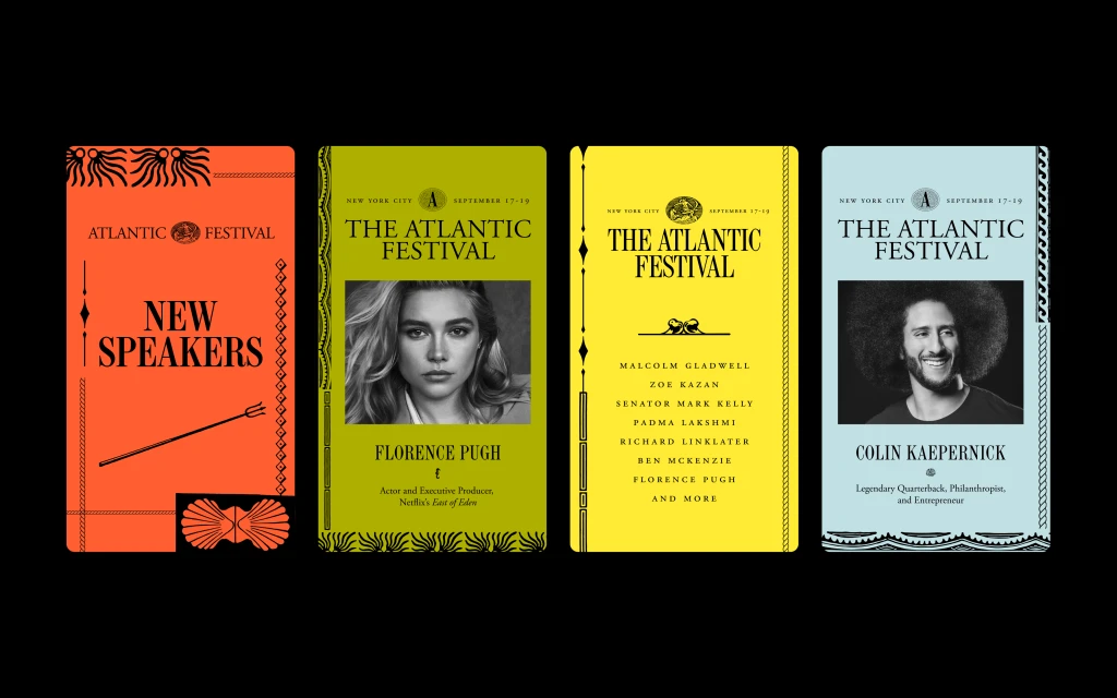
The Atlantic has unveiled a comprehensive brand identity system for The Atlantic Festival, blending historical editorial heritage with contemporary motion graphics. The design suite integrates archival woodcut engravings and classical maritime iconography—such as trident motifs and Neptune-inspired medallions—with a rigorous, modern serif typography system. By pairing these traditional elements with vibrant, punchy color blocks and clean minimalist layouts, the identity bridges the magazine's long-standing legacy with a forward-looking digital presence. Executed through a mix of static graphic design and dynamic motion sequences, the project encompasses a full range of event collateral, including social media templates, event cards, and title sequences. The identity work, created by The Atlantic with motion design by Mallandrich, leans into a retro-inspired aesthetic that emphasizes tactile, etched textures and editorial structure to unify the festival's diverse brand touchpoints.
Horizontal, Graphic
Magazines
Solid Colour

