
Taza Flores: Brand Identity




Feb 2020
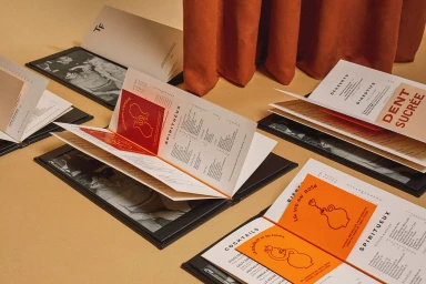
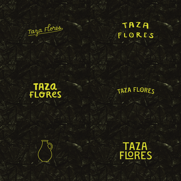
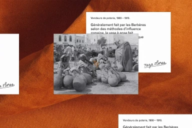
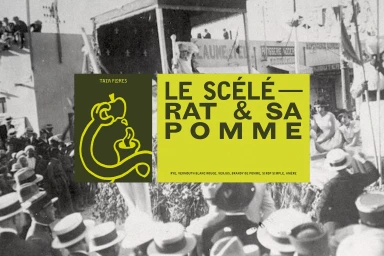
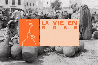
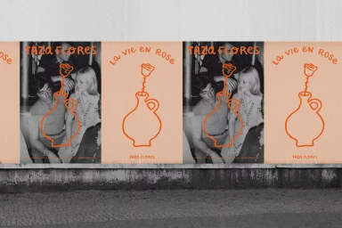
The brand identity for Taza Flores represents a sophisticated exercise in balancing archival nostalgia with contemporary graphic design. Through a deliberate fusion of historical, black-and-white photography and vibrant, high-contrast color palettes, the project establishes a distinct visual language that feels both timeless and forward-thinking. The work leans into an editorial aesthetic, utilizing complex collage techniques that juxtapose sepia-toned market scenes and vintage portraits with clean, minimalist line art and bold, modern typography. This layering creates a unique tension, allowing the brand to anchor itself in a sense of heritage while maintaining a sharp, professional edge. Beyond the screen, the identity translates into a tangible, tactile experience. Through the use of emboss and deboss finishes on matte stationery and the intentional selection of textured substrates, the design emphasizes craftsmanship and sensory depth. The consistent integration of a striking orange motif across menu booklets, street posters, and custom notebooks unifies the brand, ensuring that every touchpoint—from the macro detail of a branded cocktail glass to the larger scale of corporate collateral—remains cohesive. By blending artistic flair with precise commercial execution, the project successfully elevates the identity of Taza Flores, transforming restaurant assets into a curated collection of visual storytelling that feels as much like an art exhibit as it does a hospitality brand.
Horizontal, Commercial
Typography
Advertising Campaign
