
Superoot: Brand Identity
Brand
Date
Aug 2024
Description
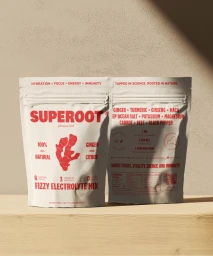
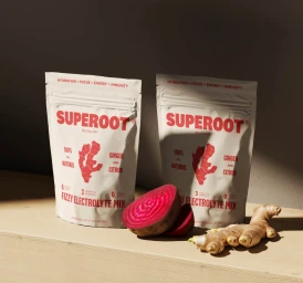
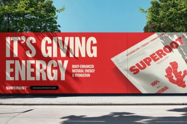
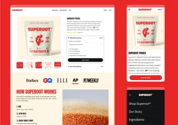
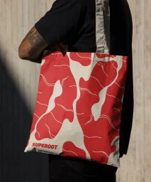
Superoot introduces its brand identity through a multi-channel commercial campaign that pairs clean graphic design with tactile, earthy product photography. The project spans digital e-commerce layouts, outdoor advertising, and lifestyle applications of the brand’s signature red-and-white aesthetic. Featuring typography-led compositions and 3D render / CGI techniques, the identity highlights key product features including natural hydration and ingredient transparency. Wheelhouse led the graphic design, balancing structured interface layouts with organic imagery.
Style
Horizontal, Commercial, Clean
Industries
Color
Crimson
Associated creatives

5000+ creatives to discover
Sign up to gain access to the entire directory. It’s free.
Visie is a curated library of creative professionals.