
SuperKül: Brand Identity

Jun 2018
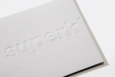
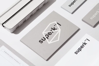
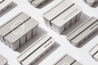
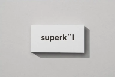
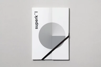
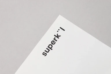
In the realm of enterprise and B2B technology, establishing a distinct visual voice is a challenge that requires both restraint and precision. The new brand identity for SuperKül succeeds by leaning into an architectural design language that prioritizes tactile quality and geometric rigor. Developed by the creative team at Blok Design, the project presents a masterclass in corporate minimalism, where every element—from the debossed letterforms on premium stationery to the stark, sans-serif typography—communicates a sense of quiet gravitas. The execution relies on a sophisticated, neutral color palette that highlights the interplay between material and space. By utilizing soft light to accentuate the depth of embossed paper stocks and the textured, industrial-feeling packaging, the identity transcends traditional software branding. The inclusion of CGI elements provides a modern, 3D render dimension that feels perfectly balanced against the physical, paper-based collateral. Through this disciplined approach to typography and grid-based composition, SuperKül establishes a professional aesthetic that feels both human-centric and technologically forward. This project demonstrates how thoughtful, minimalist graphic design can ground complex enterprise identities in physical reality, creating a cohesive visual ecosystem that is as functional as it is conceptually rich. It is a striking example of how corporate assets can move beyond mere utility to become intentional, branded expressions of spatial richness.
Horizontal, Commercial, Clean, Minimalist
Grey Seamless
