
Super Genius Society: Brand Identity



May 2025
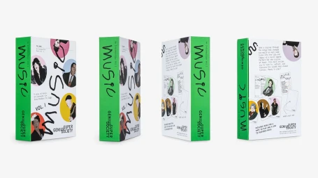
The brand identity for Super Genius Society is a comprehensive design system centered on playful typography and character-led graphic design. The project encompasses packaging, instructional collateral, and digital assets, utilizing a signature vibrant green palette contrasted against clean, minimalist white backdrops. Developed by Otherwhere Collective, the design language relies on expressive, hand-drawn typography and vector-based illustration. These elements are applied across diverse touchpoints, from product cards and book covers to animated motion graphics, creating a cohesive visual narrative that bridges historical subjects with a modern, active aesthetic. The system features custom letterforms and detailed specimens, maintaining a tactile quality through deliberate compositions. The work balances technical precision with organic, documentary-style elements, such as close-up processes of sketching and writing, to define the brand's creative personality.
Commercial, Clean
