
Studio Simdo: Brand Identity

Jan 2020
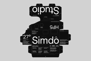
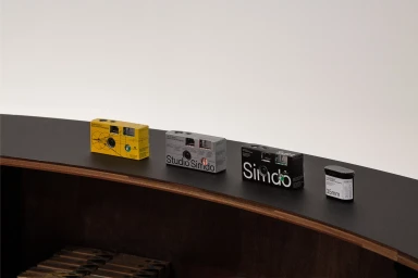
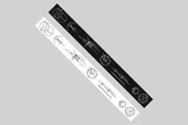
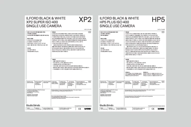
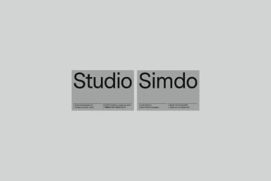
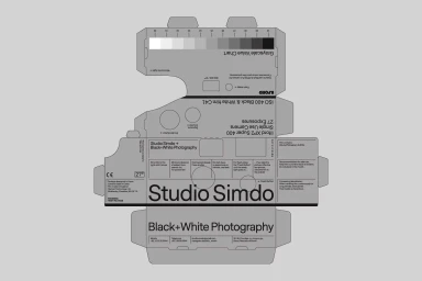
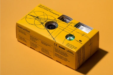
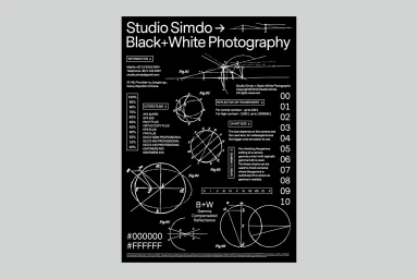
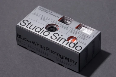
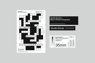
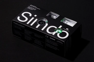
Studio Simdo’s recent brand identity project redefines the intersection of industrial utility and photographic heritage, creating a visual language that is as clinical as it is compelling. Under the precise graphic design direction of Jaehoon Choi, the studio has cultivated a distinct, monochromatic aesthetic that leans into the rigorous technicality of film photography. The work features an expansive suite of collateral, from meticulous die-cut camera packaging to corporate identity systems that function like instructional diagrams. By utilizing a strict palette of black, white, and deliberate accent tones, the design team avoids decorative excess in favor of a utilitarian minimalism. Every element, whether it is the crossword-inspired typographic grids or the vector-based optical schematics, emphasizes clarity and geometric precision. The project effectively bridges the gap between commercial product design and artistic inquiry, transforming everyday disposable cameras into collectible pieces of functional design. This approach captures the essence of analog photography through clean typography and highly structured layouts, reflecting a professional design approach that feels both timeless and modern. The resulting brand identity acts as a comprehensive reference for black and white photography, where every fold, line, and typeface serves a specific purpose in the user experience, establishing Studio Simdo as a master of intentional, minimalist communication within the competitive photography and corporate branding sectors.
Commercial, Clean, Minimalist, Horizontal
Typography, Vector
Grey Seamless
