
Standing Room
Brand Identity
Apr 2026
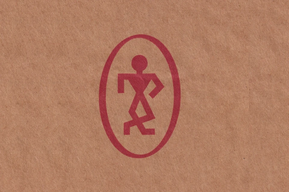
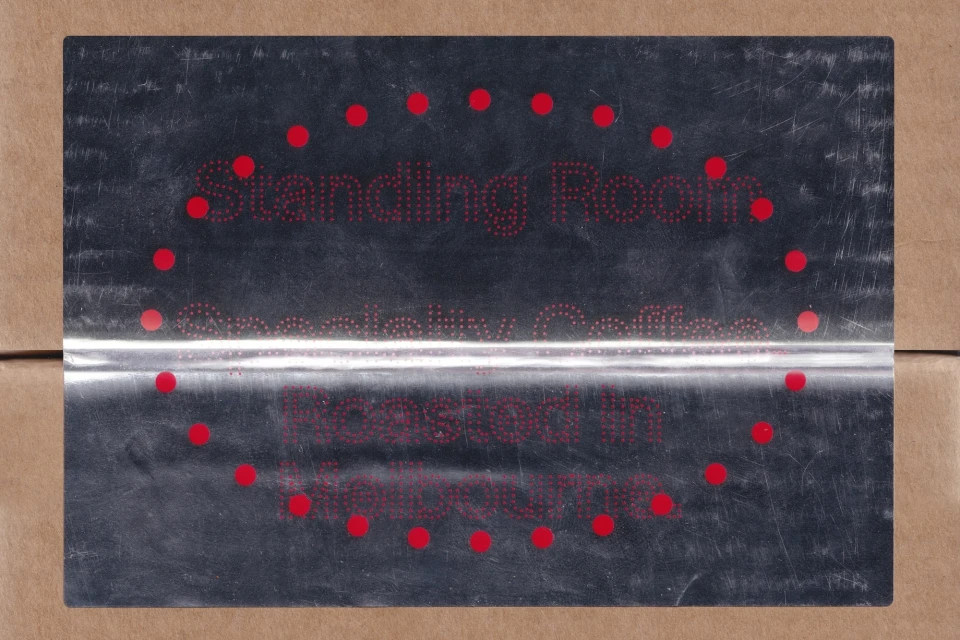
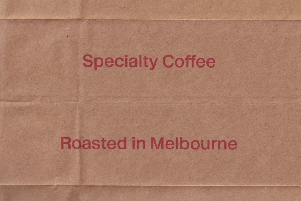
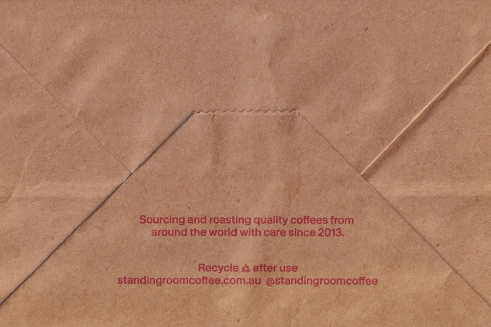
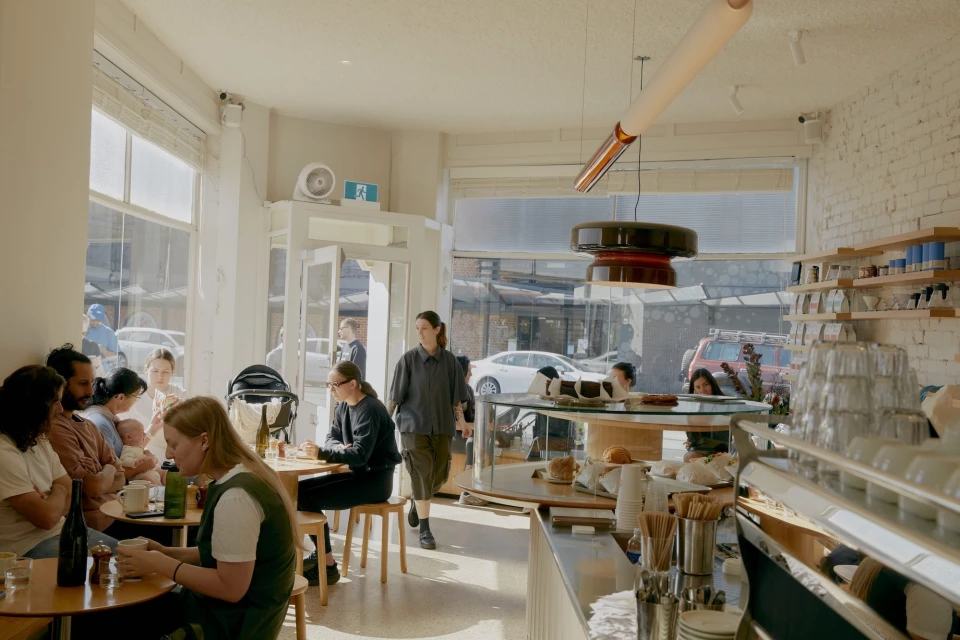
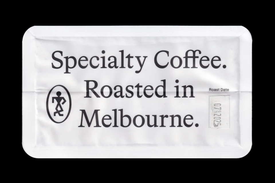
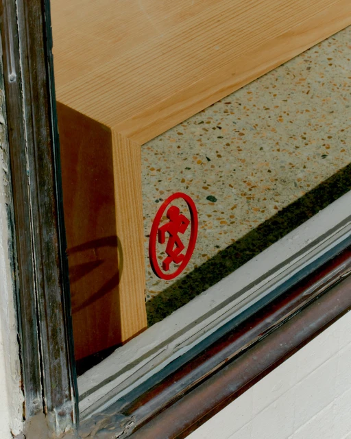
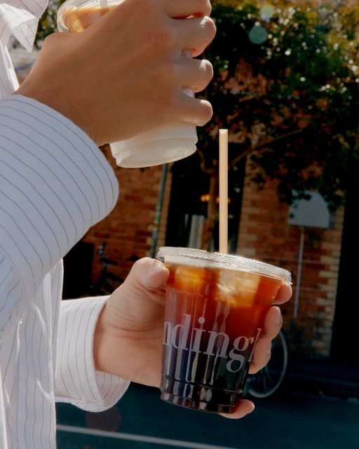
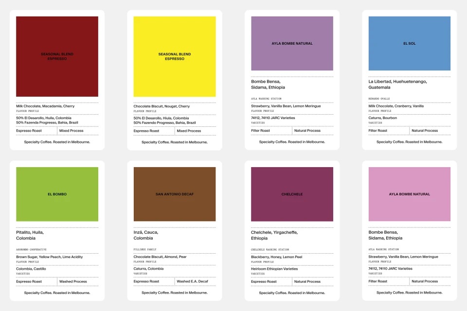
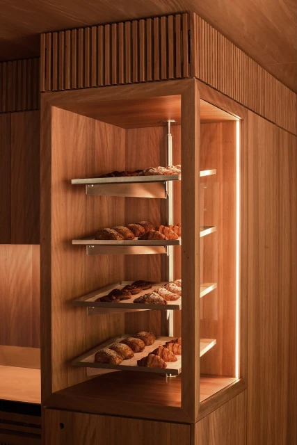
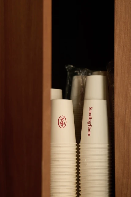
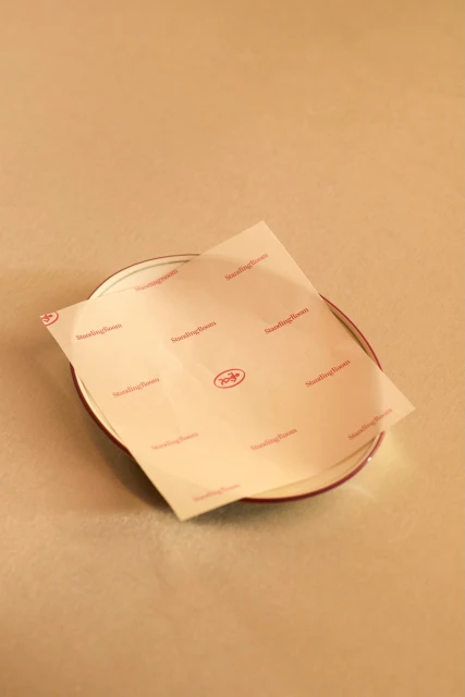
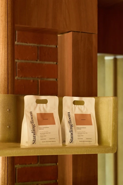
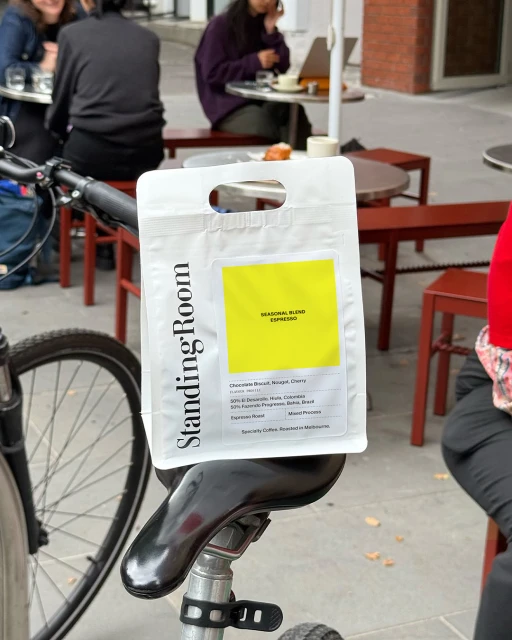
The brand identity for Standing Room masterfully balances the raw, tactile nature of specialty coffee production with a sophisticated, minimalist aesthetic. Designed by More Studio, the visual system leans into an industrial yet welcoming narrative that feels both established and contemporary. At the heart of the project is a striking, dynamic stick-figure motif rendered in a signature red, which appears across various touchpoints—from custom signage by Anchor Signs to bespoke packaging on matte kraft paper. The design language utilizes typography to its full potential, employing clean sans-serif and sharp serif fonts that anchor the brand in modern, urban Melbourne. Through high-contrast product shots by Traianos Pakioufakis and Ben Moynihan, the identity is presented with an intentional focus on texture and material, bridging the gap between digital precision and artisanal craft. The interior environment, shaped by the architectural sensibilities of Dion Hall, further embeds these elements into the physical world, using natural light to highlight the intersection of wood, stone, and brick. This project exemplifies how a cohesive brand identity can translate across diverse media, utilizing macro photography to emphasize paper quality while maintaining a lifestyle-oriented approach to commercial photography. Whether captured in a bustling, bright cafe or on a street-side bike, the identity remains sharp, structured, and inherently human, successfully communicating the soul of a specialty roaster through simple, intentional geometry.
Commercial, Clean


