
South East Centre for Contemporary Art
Brand Identity
Jul 2024
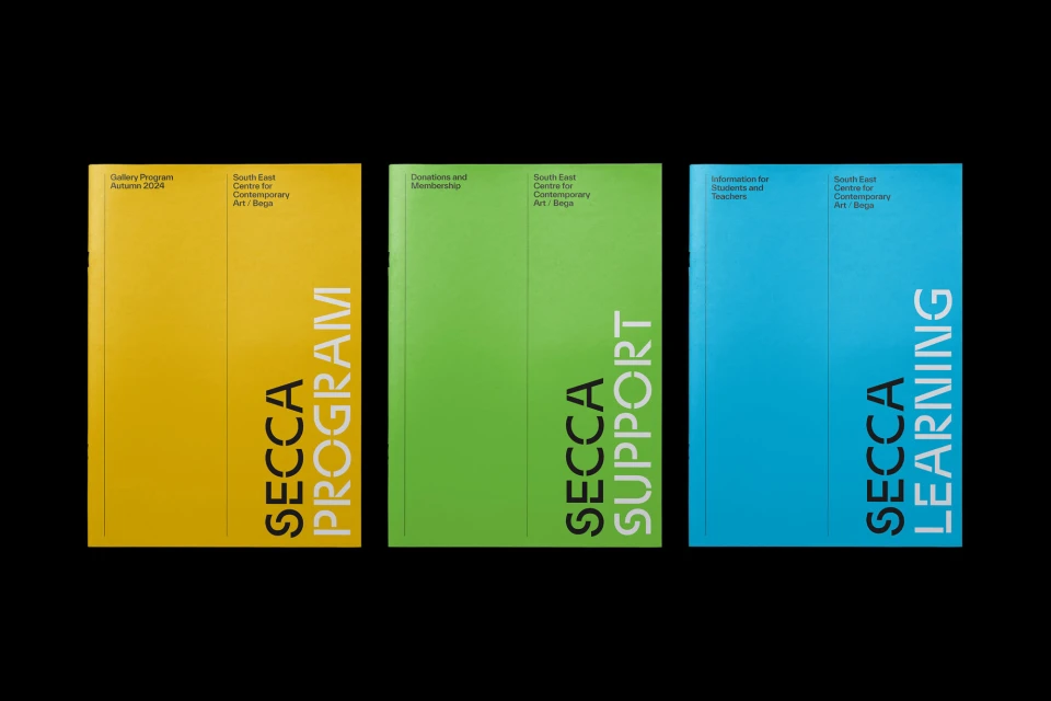
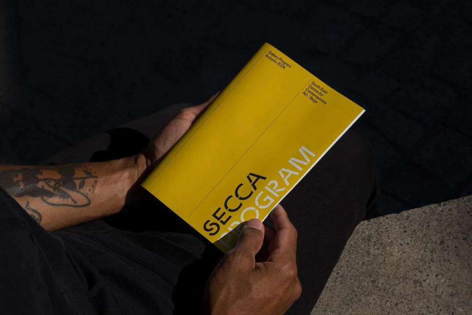
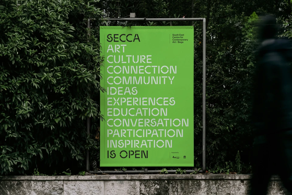
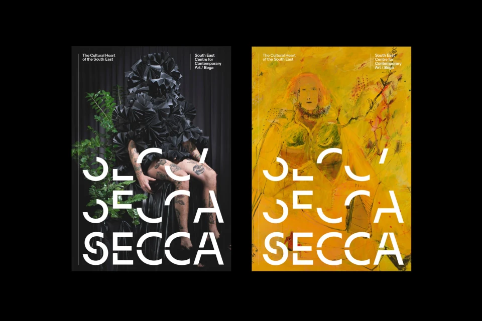
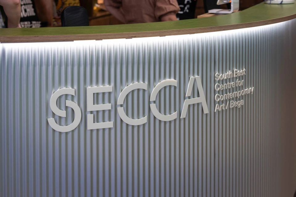
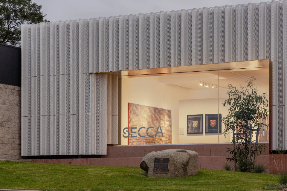
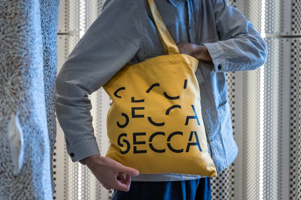
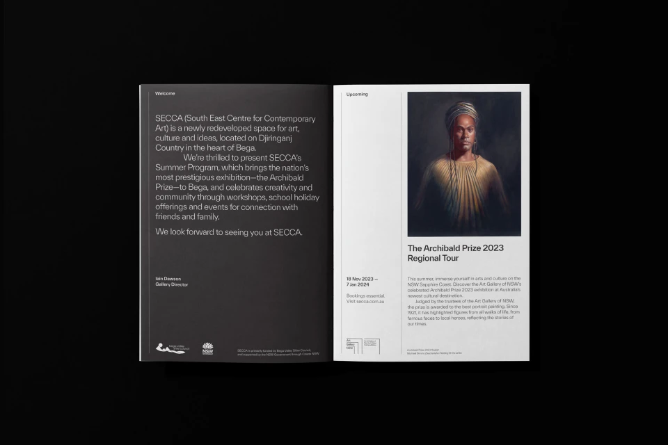
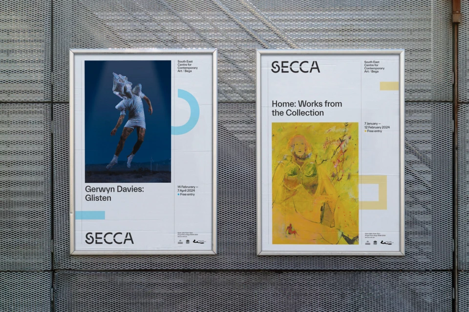
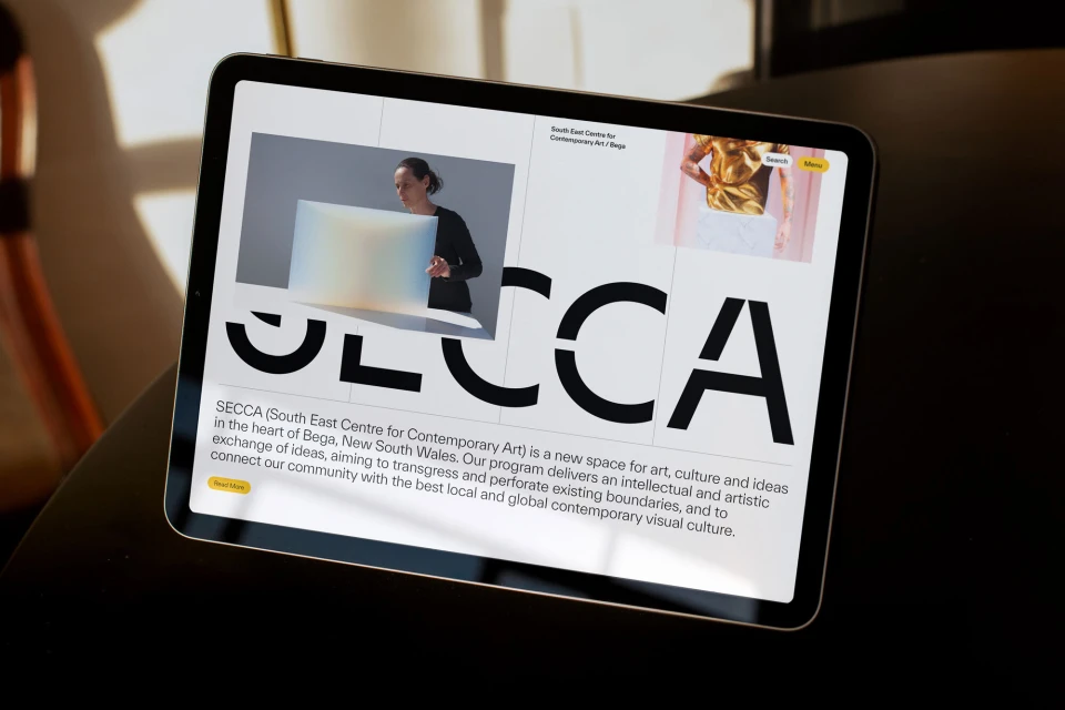
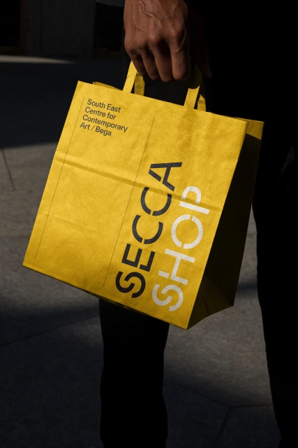
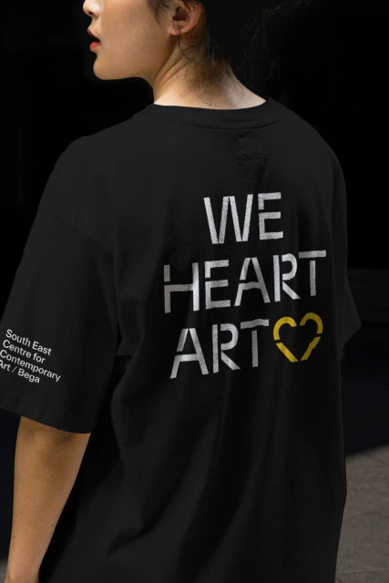
The brand identity for the South East Centre for Contemporary Art (SECCA) establishes a bold, graphic-led visual language across print, digital, and architectural touchpoints. Designed by Primary Works, the system utilizes high-contrast typography, a vibrant palette of yellow, green, and blue, and minimalist layout principles to define the institution's presence. Photography by Katherine Lu and David Rogers highlights the versatility of these assets, capturing their application on publication brochures, outdoor posters, and branded apparel. The execution leans into a clean, modern aesthetic that balances technical typography with architectural textures and natural light. Beyond print collateral, the branding extends to web interfaces and interior environmental elements, such as the facility’s custom reception desk. The project demonstrates a consistent grid-based structure, resulting in a cohesive identity that integrates digital media and physical signage.
Horizontal, Commercial, Clean
Digital Media & Publishers
Advertising Campaign


