
Brand
ProjectBrand Identity
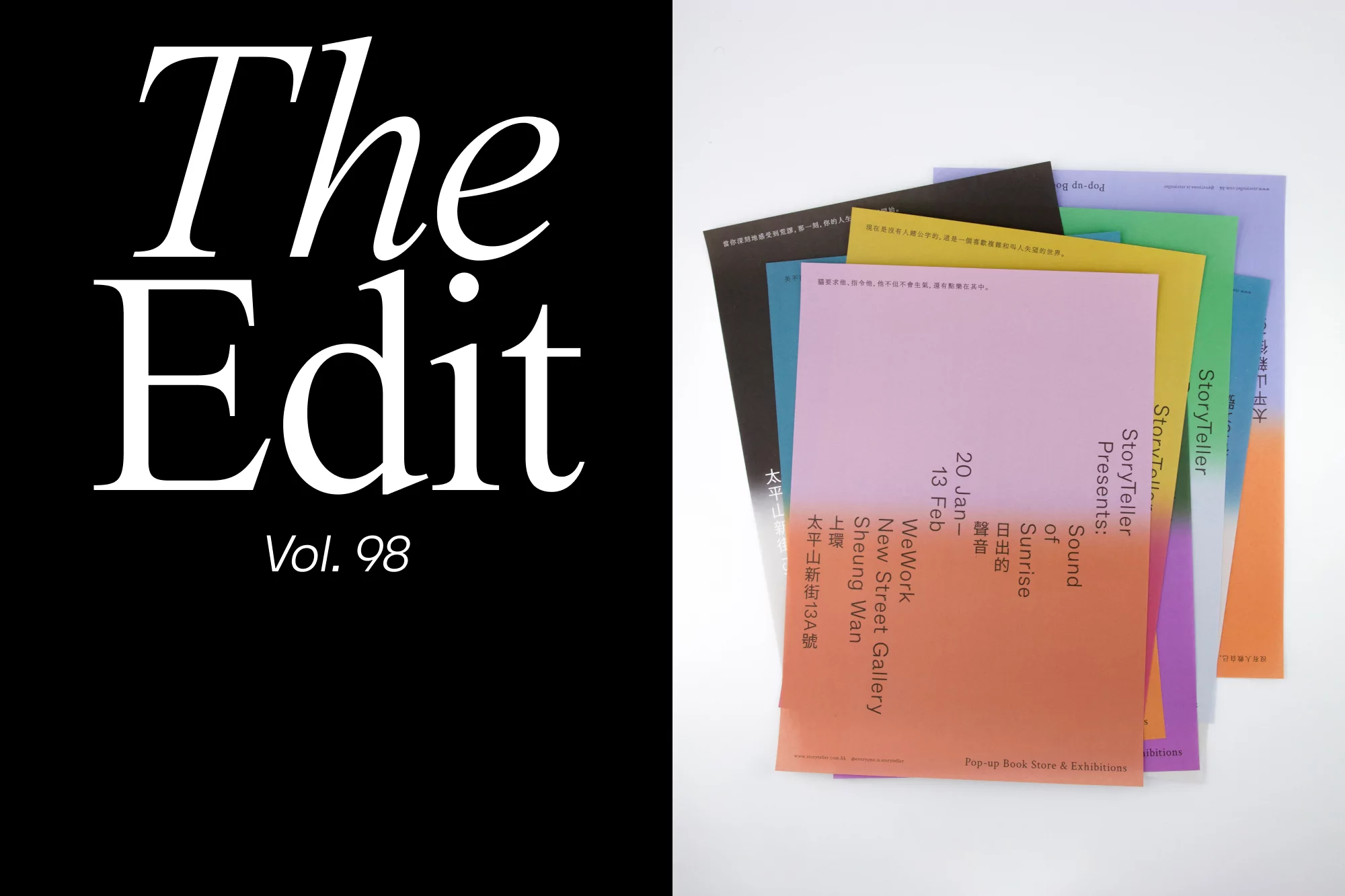
Sound of Sunrise Brand Identity 2022
Associated creatives


Tags
Description
This graphic design project for Sound of Sunrise features a split-screen composition with bold white serif typography reading The Edit Vol. 98 against a solid black background on the left. On the right, a collection of colorful printed flyers and promotional cards are neatly fanned out against a clean white surface. The printed materials display typography and gradient color blocks in peach, green, purple, and yellow. The clean studio lighting highlights the paper textures and sharp alignment of the editorial design.
Style
Horizontal, Commercial, Clean, Minimalist
Techniques
Typography
Industries
Digital Media & Publishers
Color
Jet Black (50%)
Pure White (50%)
Background
White Seamless
Context
Website / Web