
Song for the Mute: Brand Identity




Jul 2019
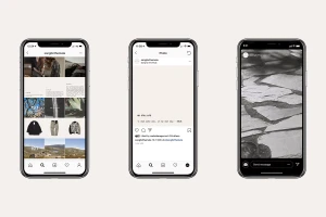
The brand identity for Song for the Mute serves as a masterclass in atmospheric minimalism, where the boundaries between commercial product design and artistic installation blur. Developed with sharp graphic design from Assembly London, the project articulates a sophisticated visual language that leans into an archival aesthetic. By juxtaposing the raw, textured quality of dried botanicals and crinkled materials against the clinical precision of sans-serif typography, the identity establishes a narrative-driven depth rarely seen in contemporary fashion branding. Whether through the lens of macro photography that elevates a simple brass pendant or the documentary feel of grainy, high-contrast imagery, the work maintains a cohesive tension between the industrial and the organic. The digital execution on UI interfaces utilizes generous negative space and typewriter-style fonts to evoke a sense of journalistic intent, grounding the brand in a space that feels both timeless and highly curated. Every element, from the deliberate, symmetric hanging installations in retail spaces to the tactile, layered paper of the collection swing tags, reflects a commitment to subtle, disciplined storytelling. This project is a cohesive study in minimalism, utilizing natural light and cinematic composition to transform everyday product identifiers into components of a larger, immersive world that feels distinct, intentional, and deeply resonant with the brand's core values.
Horizontal, Commercial, Clean, Minimalist
Advertising Campaign
