
Sonder: Brand Identity

Brand
Date
Oct 2024
Description
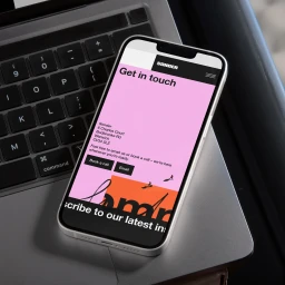
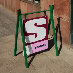
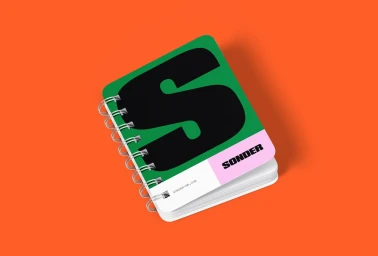
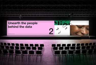
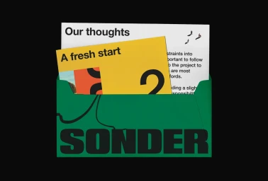
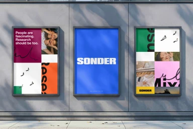
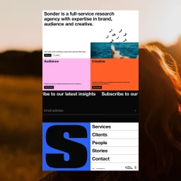
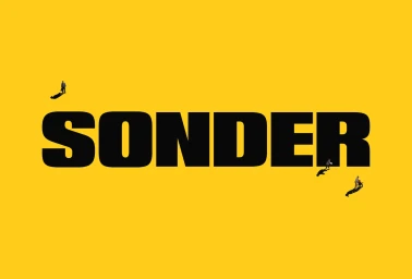
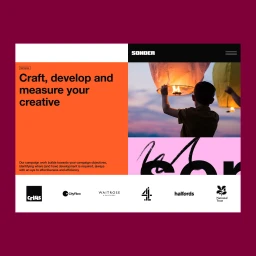
The brand identity for Sonder, developed by OHMY, establishes a cohesive visual language across both physical and digital touchpoints. The project employs a minimalist, graphic-led approach, utilizing a vibrant color palette of green, pink, orange, and blue to structure web interfaces, print materials, and environmental signage. By layering bold typography with clean geometric blocks, the work maintains a structured aesthetic that frames both abstract data and personal imagery. The identity extends into motion graphics and cinematic content, integrating live-action elements with rigid grid systems to balance technical clarity with human connection.
Style
Commercial, Clean, Horizontal
Industries
Associated creatives

5000+ creatives to discover
Sign up to gain access to the entire directory. It’s free.
Visie is a curated library of creative professionals.