
SOLELY
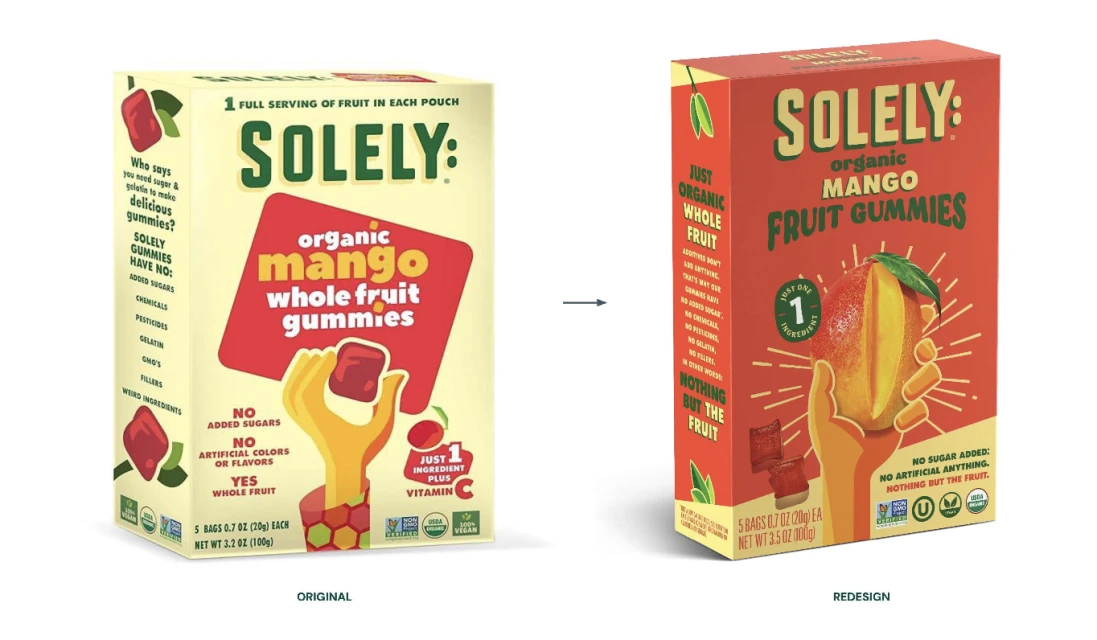
FORTNIGHT COLLECTIVE’S REBRANDING CAMPAIGN FOR SOLEY FRUIT JERKY
Brand
Date
Feb 2026
Description
Fortnight Collective leads the rebranding initiative for Solely, focusing on the visual evolution of their organic fruit jerky line. The campaign highlights a transition in packaging design, moving from a bold, typography-heavy layout toward a refined aesthetic that prioritizes high-impact product imagery and clarified messaging. Captured in a clean studio environment, the assets emphasize the shift in visual identity. The execution utilizes commercial vector design principles to contrast the original packaging with the updated, vibrant presentation, documenting the brand's pivot in the packaged food market.
Style
Horizontal, Commercial, Clean
Techniques
Vector
Industries
CPG / Packaged Food
Color
Golden Yellow
Scarlet
Background
White Seamless
Context
Advertising Campaign
Associated creatives

5000+ creatives to discover
Sign up to gain access to the entire directory. It’s free.
Visie is a curated library of creative professionals.