
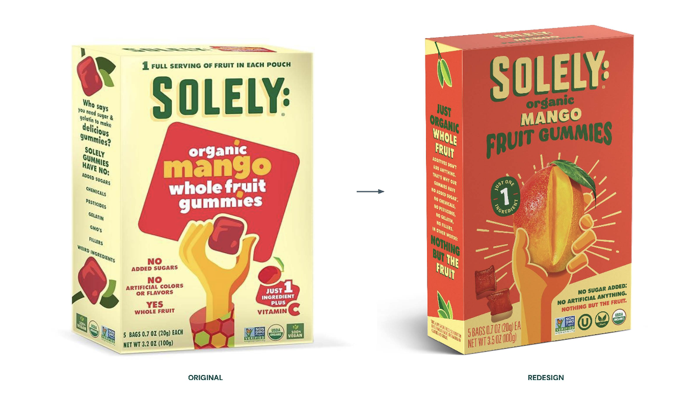
SOLELY FORTNIGHT COLLECTIVE’S REBRANDING CAMPAIGN FOR SOLEY FRUIT JERKY 2026
Associated creatives

Tags
Description
This image displays a packaging comparison from Fortnight Collective's rebranding campaign for Solely organic mango whole fruit gummies. The left side shows the original yellow and red product box featuring bold typography, organic fruit callouts, and a hand illustration holding a gummy piece. The right side shows the updated redesign with a vibrant red and yellow color palette, enhanced mango imagery, and streamlined product messaging. An arrow points from the original packaging to the redesign against a clean white studio background. The composition highlights the evolution of the brand visual identity and packaging strategy.