Logo
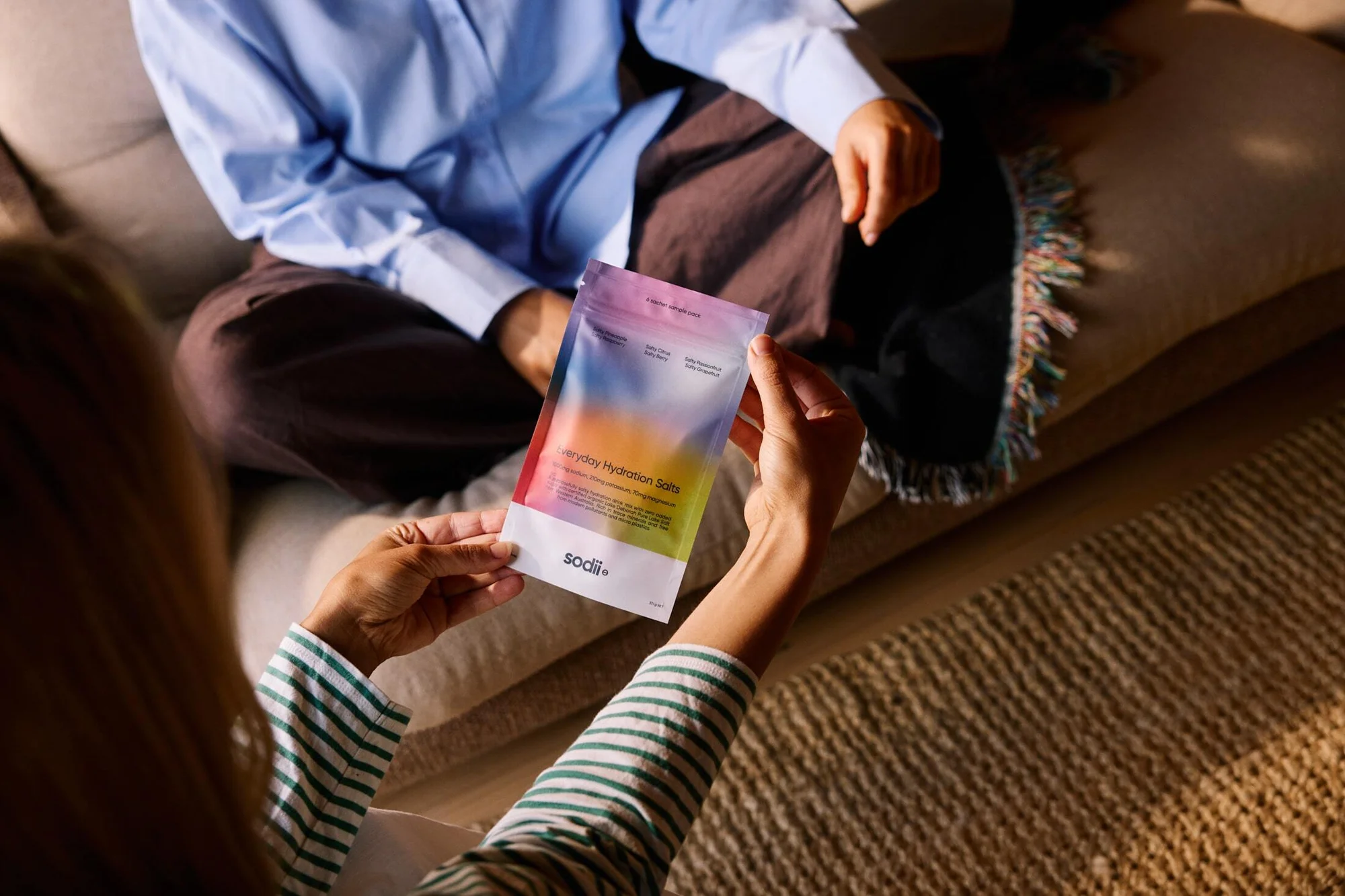
Person holding a colourful Sodii hydration salts pouch in a living room setting
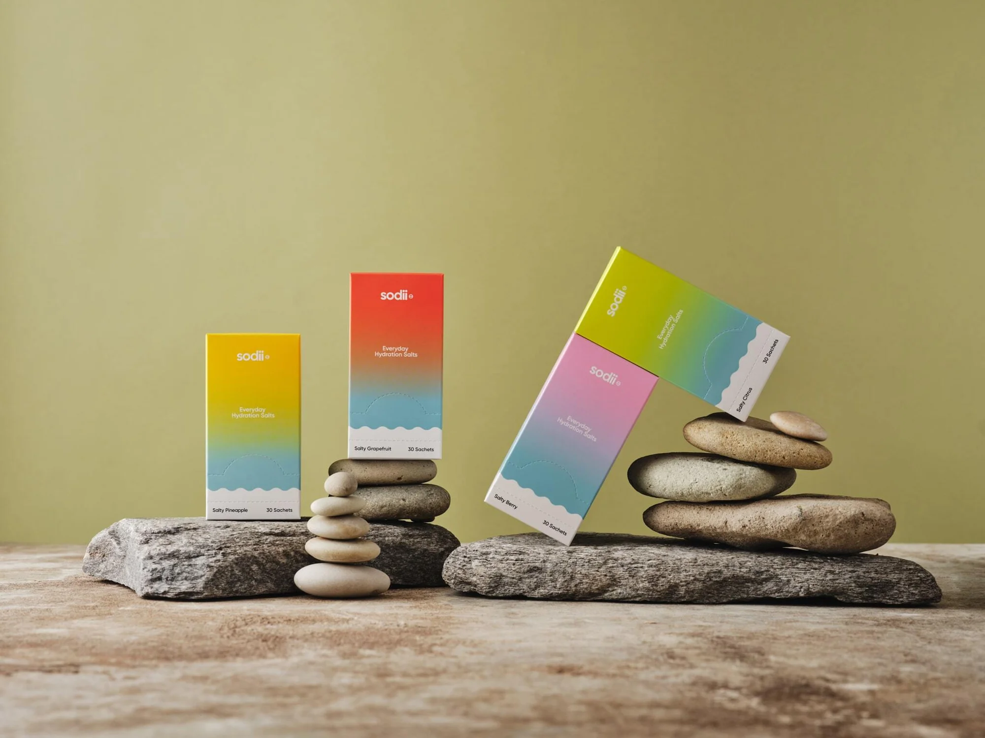
Colorful Sodii hydration salt boxes arranged neatly on flat stones and stacked river rocks against an olive green backdrop.
Product jars arranged among stacked smooth river stones on a textured surface against an olive green background for Sodii brand identity.
Product still life photography for Sodii brand identity featuring citrus fruit, a hydration salt sachet, and glassware on a warm background.
Person wearing an olive green jacket pouring a small sachet into a clear water bottle against an overcast sky.
Balanced stack of whole and sliced grapefruits on a glass with a Sodii hydration salt packet and salt pile on a tan surface.
Sodii everyday hydration salts product box resting atop an arrangement of citrus fruits against a warm yellow background.
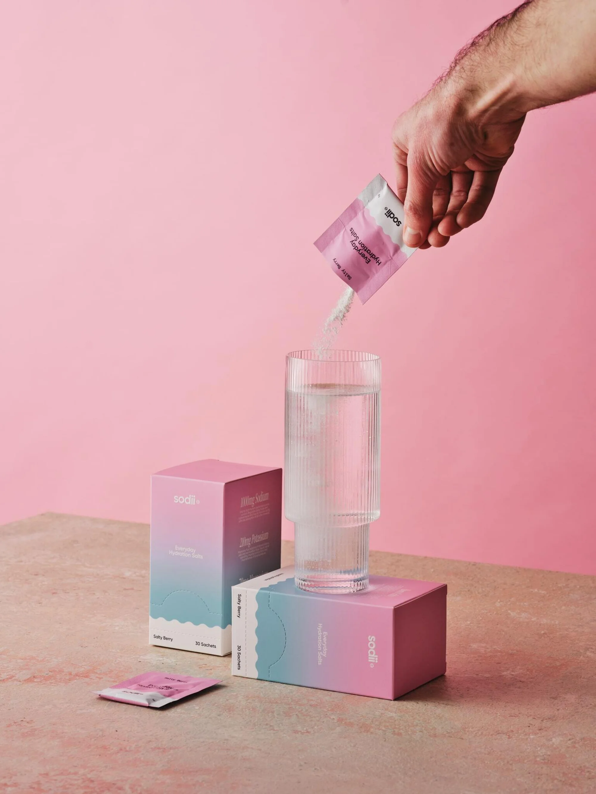
Hand pouring a pink sachet packet into a tall ribbed glass of water next to Sodii product boxes on a tabletop.
Four colorful gradient product packaging boxes arranged diagonally on a textured stone surface against a yellow wall
Open cardboard subscription box containing a product carton, accompanied by a folded printed brochure on a textured stone surface.
Person holding a colourful Sodii hydration salts pouch in a living room setting
Colorful Sodii hydration salt boxes arranged neatly on flat stones and stacked river rocks against an olive green backdrop.
Product jars arranged among stacked smooth river stones on a textured surface against an olive green background for Sodii brand identity.

Sodii Brand Identity 2025

About

The brand identity for Sodii, a hydration salt manufacturer, balances clinical utility with organic, tactile aesthetics. The campaign leverages a warm, earthy color palette and minimalist product compositions to ground the brand in a natural, lifestyle-oriented space. Through a combination of lifestyle imagery and studio still life, the work emphasizes the brand's vibrant, gradient-heavy packaging design. Captured by photographer Brendan Homan and featuring graphic design by Divide, the identity employs clean, natural light to highlight textures ranging from raw citrus and river stones to matte packaging and glass. The visual language favors a polished, graphic approach that translates across both outdoor utility shots and staged product displays.

Brand

Credits

Industries

Styles

Techniques

5000+ creatives to discover

Sign up to gain access to the entire directory. It’s free.

Visie is a curated library of creative professionals.
Trusted by