
SAVEME: Brand Identity
Brand
Date
Jul 2021
Description
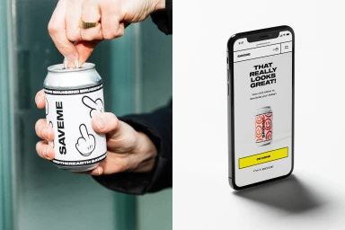
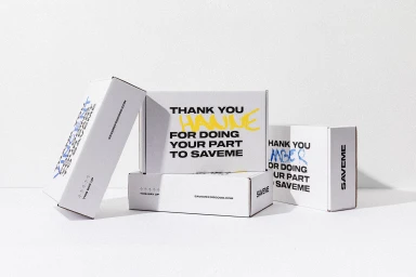
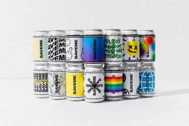
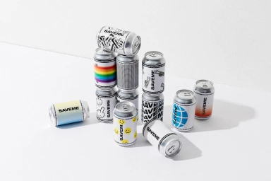
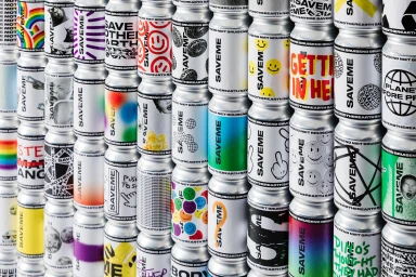
The brand identity for SAVEME, developed by SKINN, establishes a cohesive visual language across both physical and digital beverage touchpoints. The project focuses on a versatile system, utilising typography and varied graphic patterns to differentiate product packaging. Design execution spans from custom-labeled aluminum cans to minimalist e-commerce web interfaces. The visual identity incorporates a range of graphic treatments including gradients, illustrative motifs, and bold wordmark placement, all presented with clean studio lighting and minimalist composition.
Style
Horizontal, Commercial, Clean
Industries
Color
Pure White
Jet Black
Background
White Seamless
Context
E-commerce / Product
Associated creatives

5000+ creatives to discover
Sign up to gain access to the entire directory. It’s free.
Visie is a curated library of creative professionals.