
Brand
ProjectBrand Identity
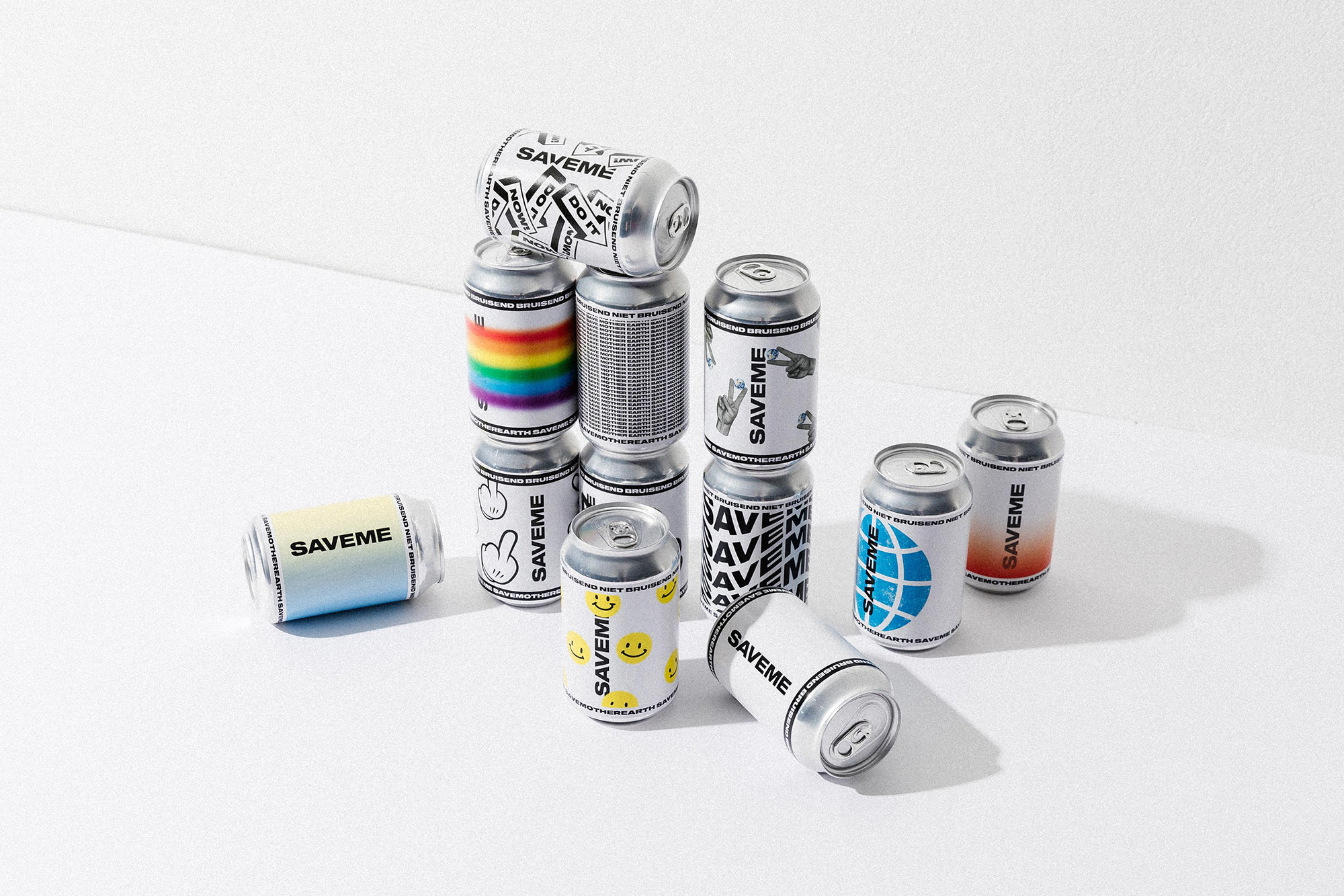
SAVEME Brand Identity 2021
Associated creatives

Tags
Description
This brand identity project for SAVEME showcases an arrangement of aluminium beverage cans featuring various graphic designs, typography, and illustrations. The cans are stacked and scattered across a clean white seamless surface, creating a dynamic composition with sharp cast shadows. Individual cans display distinct visual styles including rainbow gradients, repeating typographic patterns, smiley faces, and globe graphics. The product packaging is presented with clean studio lighting that highlights the metallic finish of the lids and the matte texture of the printed labels.