
Sage Geosystems: Brand Identity
Aug 2025
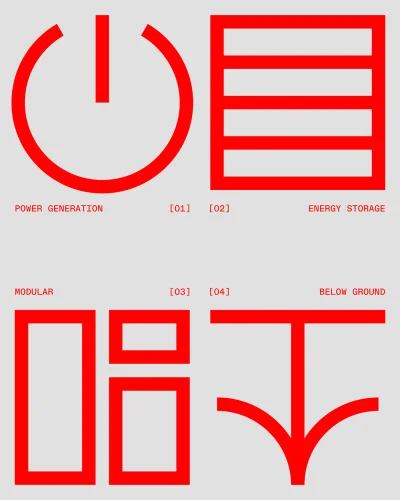
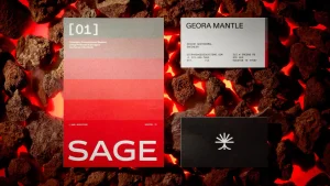
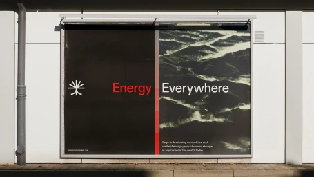
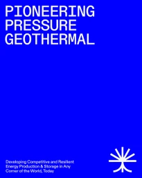
Sage Geosystems’ brand identity project focuses on a modern, technical aesthetic tailored for the technology and enterprise software sectors. The work centers on minimalist vector iconography, utilizing clean geometric lines and a neutral palette punctuated by red and blue accents. Across the campaign, the design language balances high-contrast monochrome layouts with desaturated aerial photography to communicate energy infrastructure and technical specifications. The project incorporates structured motion graphics and typography, highlighting font weight, leading, and precise alignment. Graphic designer Alek Blik, motion designer Sarah Chokali, and photographer Jack Nesbitt collaborated on the identity, which extends from digital motion assets to physical stationery and billboard applications.
Vertical, Commercial, Minimalist
Motion Graphics
Brand Film / Corporate Video


