
Brand
ProjectBrand Identity
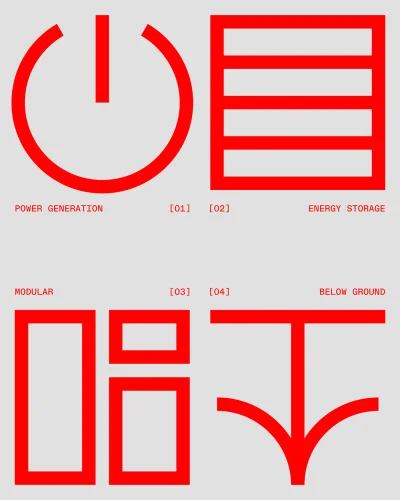
Sage Geosystems Brand Identity 2025
Associated creatives


Tags
Description
This graphic design piece presents the brand identity for Sage Geosystems, showcasing a minimalist layout with four bold red geometric icons arranged in a grid against a neutral grey background. Accompanied by precise monospace typography labeling key concepts such as power generation, energy storage, modularity, and below ground, the composition reflects a clean and structured aesthetic. The project credits Alek Blik for graphic design, Sarah Chokali for motion, and Jack Nesbitt for photography, alongside Sage Geosystems.