
Rock Werchter: Brand Identity
Jan 2023
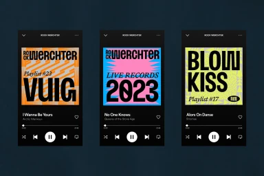
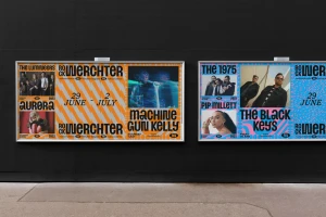
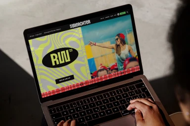
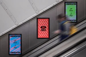
The brand identity for the music festival Rock Werchter captures a high-energy aesthetic through a system of bold custom typography and saturated color palettes. Developed as a comprehensive visual toolkit, the project integrates dynamic motion graphics with a functional UI illustration approach to engage audiences across digital and physical touchpoints. The design framework, created with graphic design by TIN, leans into a modular style defined by geometric pattern overlays and vibrant, neon-inflected backgrounds. This visual language extends from responsive mobile website interfaces to large-scale outdoor advertising, utilizing high-contrast layouts to elevate event information and artist lineups. Techniques such as kinetic motion graphics and clean typography treatments ensure consistency across diverse platforms, from animated social assets to static billboard posters. The execution prioritizes legibility and impact, employing an expansive range of colors to reflect the festival's scale and atmosphere.
Graphic, Commercial, Horizontal
