
Riad El Aaiün
Brand Identity
Mar 2026
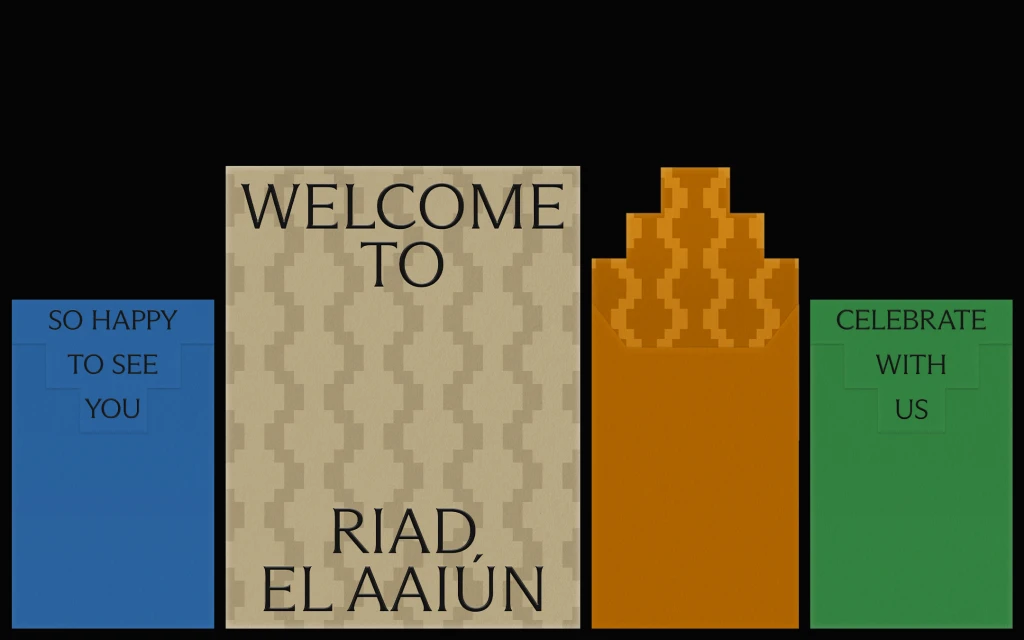
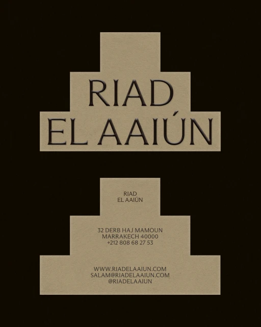
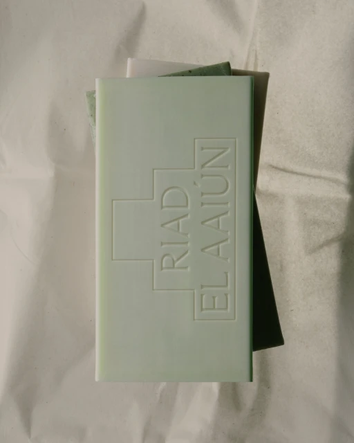
The brand identity for Riad El Aaiün masterfully bridges the gap between traditional hospitality warmth and modern, structural design. Developed by the creative team at Phantasia, the visual system leans into a sophisticated, minimalist aesthetic that feels both rooted in heritage and firmly contemporary. The project utilizes a refined color palette of deep browns, soft beiges, muted greens, and warm oranges, creating a cohesive visual language that functions seamlessly across both digital and physical touchpoints. Key to this identity is the bold use of typography, which toggles between elegant, high-contrast serif lettering and clean, accessible sans-serifs, ensuring that the brand voice remains legible yet distinguished. By employing geometric motifs—such as the recurring wave patterns and stepped pyramidal forms—Phantasia evokes the architectural nuances of the region while maintaining a professional, commercial edge. This attention to detail extends to tactile applications, including custom-debossed soap packaging that emphasizes a sense of luxury through depth and material interaction. Utilizing vector graphics and controlled studio strobe lighting, the work achieves a level of crisp, symmetrical precision that is essential for premium hospitality branding. Ultimately, the identity for Riad El Aaiün succeeds by prioritizing structural clarity and refined color-blocked layouts, offering guests a welcoming, curated, and highly memorable introduction to the property through a unified and polished brand ecosystem.
Commercial, Vertical, Clean
Solid Colour
Brand Film / Corporate Video
