Redheads: Brand Identity
May 2026
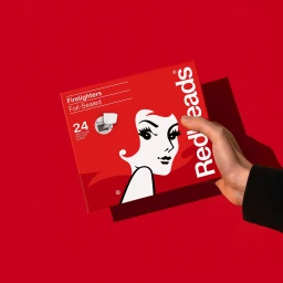
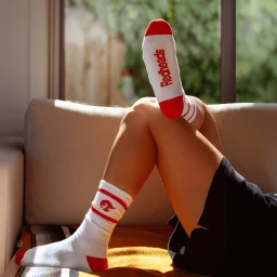
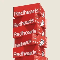
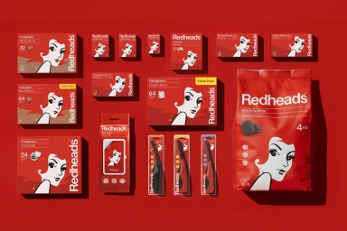
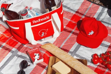
The latest brand identity work for Redheads is a masterclass in cohesive visual storytelling, successfully bridging the gap between utilitarian product design and aspirational lifestyle branding. Through a series of meticulously crafted assets, the project emphasizes a bold, monochromatic red palette that anchors the brand in a high-impact, recognizable aesthetic. Oliver Grace delivers a sharp design language that leans into editorial minimalism, utilizing clean, white sans-serif typography to contrast against the vibrant, signature packaging. The execution effectively shifts between clinical, studio strobe photography—which highlights the uniform, graphic nature of the product range—and warm, inviting lifestyle compositions that anchor the brand in relatable, everyday moments. Whether it is a flat-lay of firelighters on a vibrant backdrop or an intimate, high-key picnic scene, the project manages to make everyday household staples feel both contemporary and essential. The consistent use of the stylized illustration of a woman with red hair serves as a through-line, reinforcing brand recognition across diverse mediums from apparel to outdoor essentials. By prioritizing natural light in lifestyle shots while maintaining a disciplined, commercial approach to product photography, the work creates a compelling narrative around comfort, utility, and modern design. This identity refresh demonstrates that even the most established household names can achieve a fresh, editorial polish that resonates deeply with a modern, design-conscious consumer demographic.
Horizontal, Commercial, Clean