
Raw Perfection: Brand Identity
Brand
Date
Mar 2024
Description
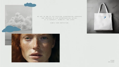
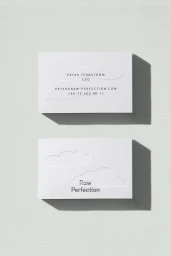
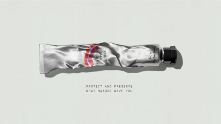
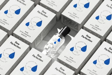
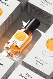
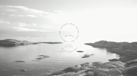
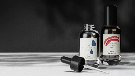
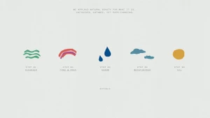
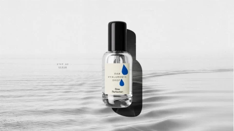
The brand identity for skincare label Raw Perfection, developed by EVERLAND, leans into a minimalist aesthetic defined by clean typography and tactile graphic design. The system utilizes a consistent visual language, incorporating abstract icons and desaturated landscape imagery to reflect a natural, curated approach to skincare rituals. Techniques including emboss and deboss detailing, combined with 3D render and CGI, emphasize the material quality of the product packaging. The design, which spans from primary containers to collateral like tote bags and business cards, relies on a balanced use of negative space and clear, sans-serif messaging.
Style
Horizontal, Clean, Minimalist, Commercial
Industries
Color
Pure White
Context
E-commerce / Product
Associated creatives

5000+ creatives to discover
Sign up to gain access to the entire directory. It’s free.
Visie is a curated library of creative professionals.