
Queer Film Festival Utrecht
Brand Identity
Feb 2026
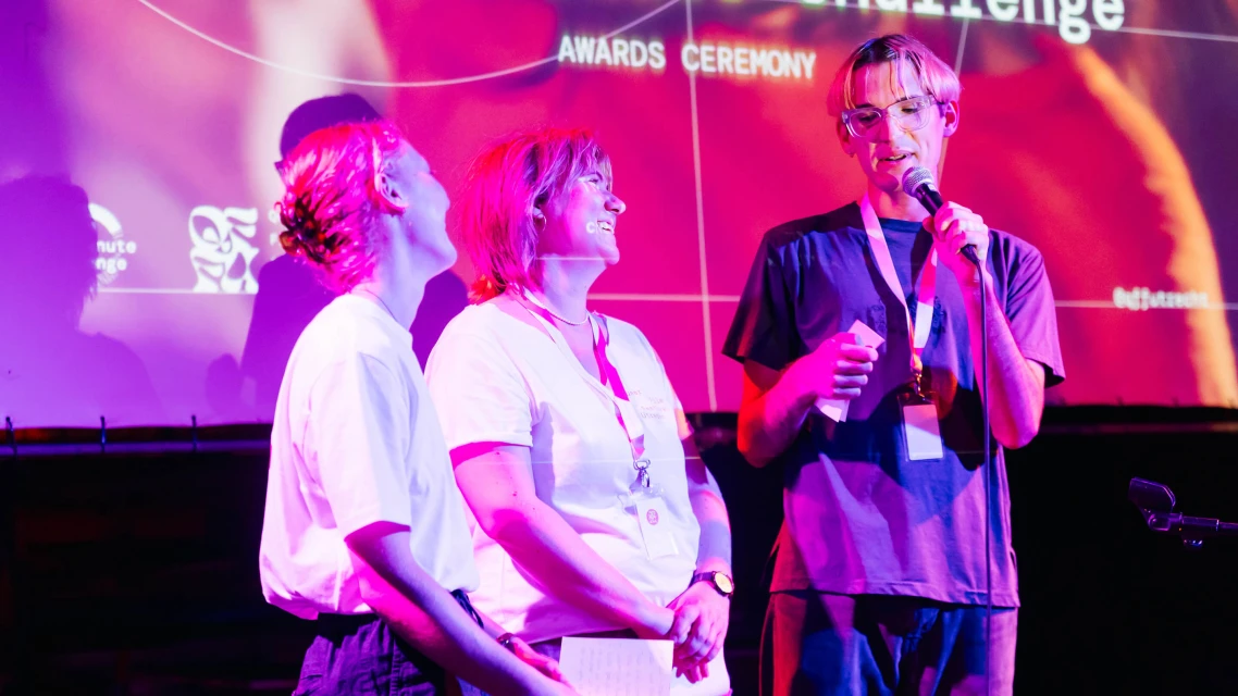
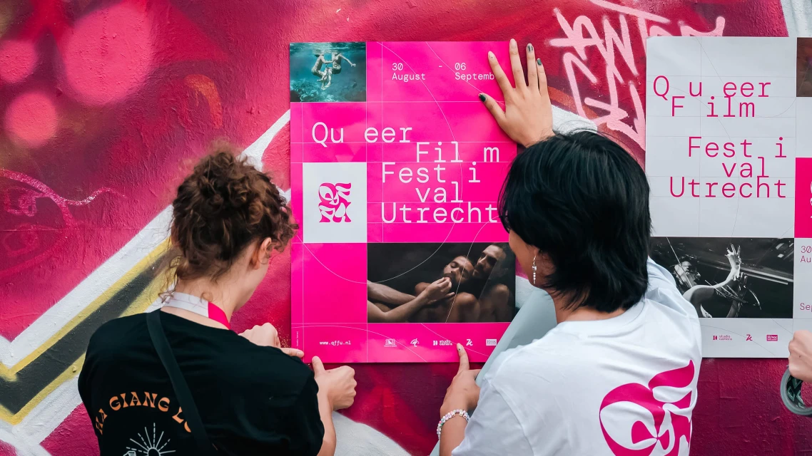
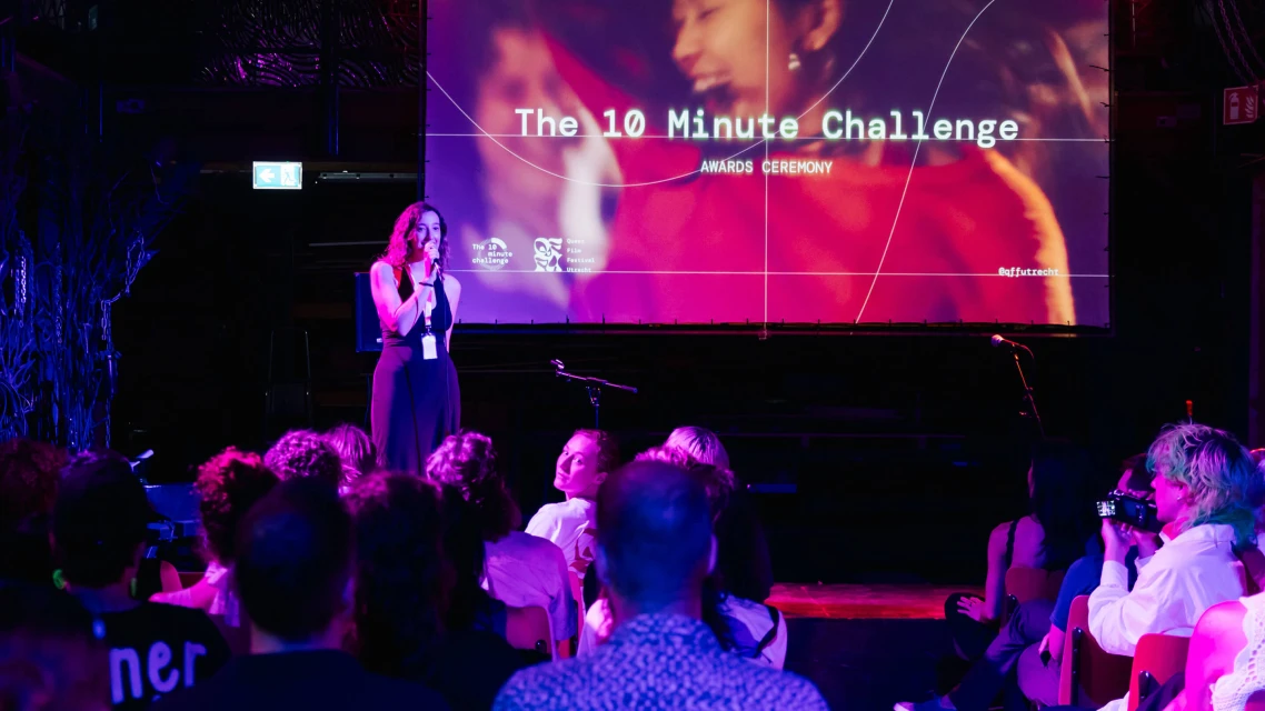
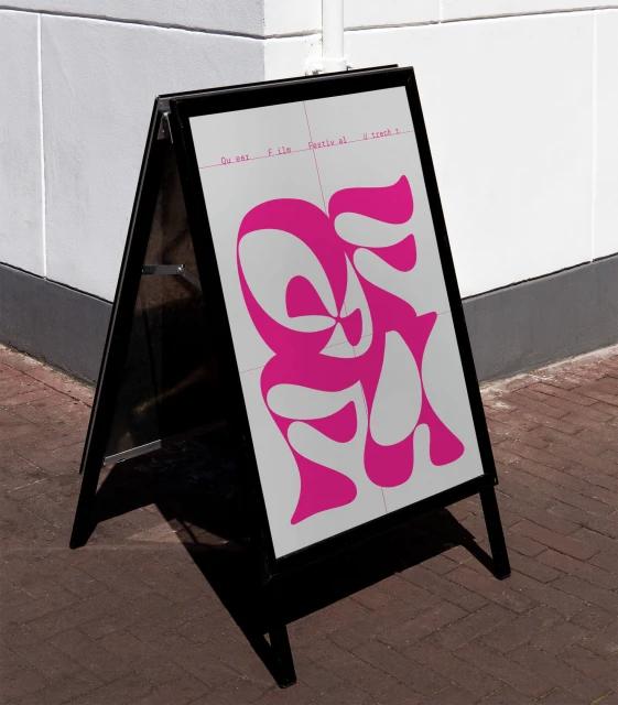
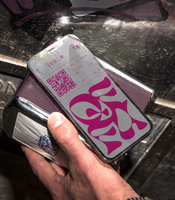
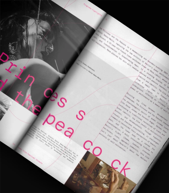
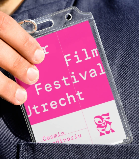
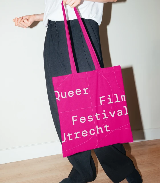
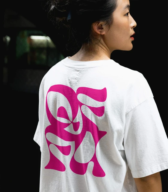
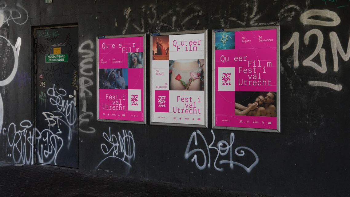
The brand identity for the Queer Film Festival Utrecht serves as a masterclass in modern visual communication within the media and entertainment sector. Crafted with precision by Studio Kartel, the project leans into a bold, high-contrast aesthetic that utilizes a signature hot pink palette to command attention across diverse platforms. The design system is anchored in strong typography, featuring clean, monospaced sans-serif letterforms that balance effectively against abstract, fluid graphics. This intentional interplay of minimalism and saturation is not merely decorative; it functions as a versatile framework that adapts seamlessly from digital mobile tickets and editorial magazine spreads to physical event collateral like ID badges and tote bags. By integrating live-action techniques with sharp graphic design, the identity bridges the gap between official commercial visibility and a grassroots, urban sensibility. Whether displayed on textured graffiti-covered walls or within the cinematic lighting of an awards ceremony, the branding maintains a cohesive presence that is both professional and authentically expressive. The use of natural light in commercial lifestyle shots enhances the tactile quality of the festival materials, ensuring that every touchpoint resonates with clarity. Ultimately, the project succeeds by layering these graphic elements with a sense of purpose, turning everyday event logistics into a distinct visual experience that defines the festival's unique creative character.
Clean, Horizontal, Commercial
Festivals & Events
