
POV Budapest
Brand Identity
Apr 2025
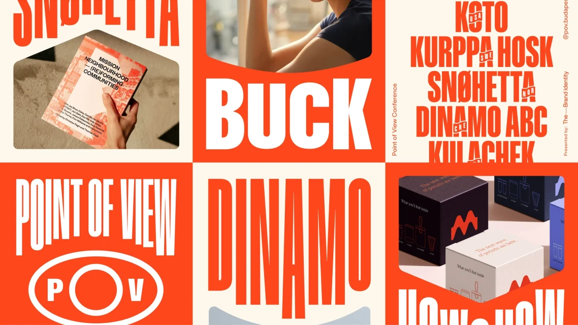
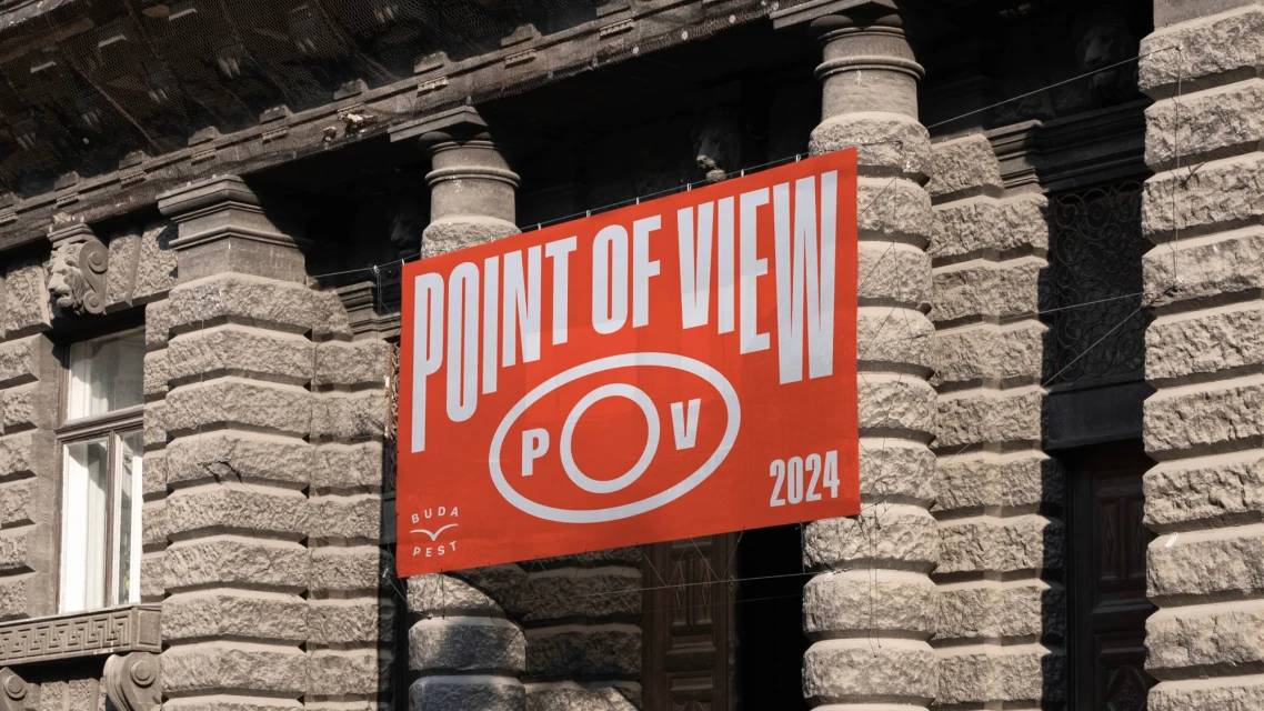
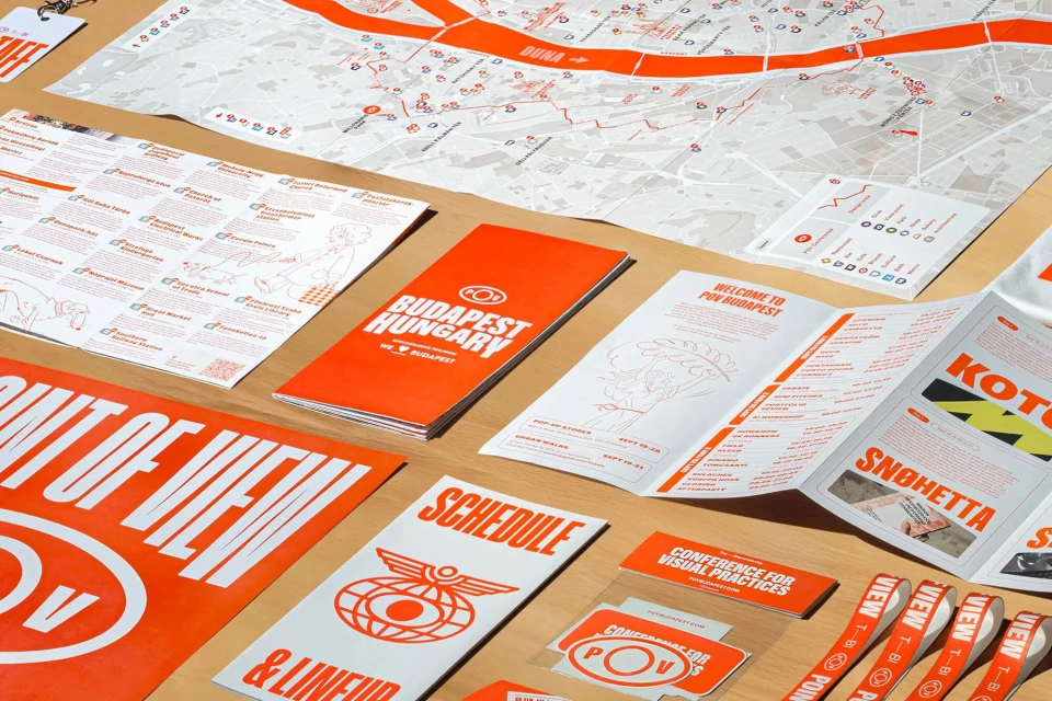
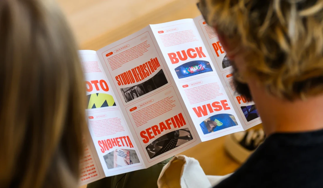
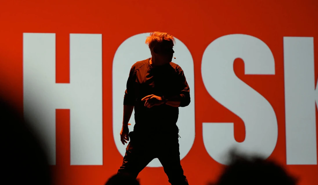
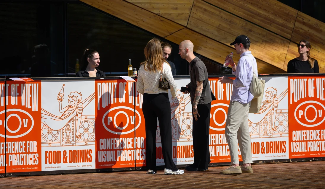
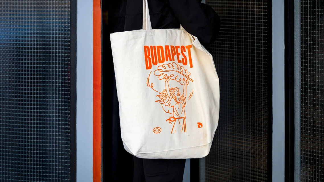
The brand identity for POV Budapest establishes a comprehensive visual language spanning physical, digital, and environmental touchpoints. Built upon a high-contrast palette of red, orange, and white, the system utilizes bold typography and structured grid layouts to unify conference materials, signage, and collateral. Execution across printed brochures, event barriers, and canvas merchandise relies on clean graphic design and intentional white space. The digital extension of the identity features minimalist motion graphics and UI elements that integrate with architectural photography to anchor the brand within the urban landscape. Creative development was led by CM.SUPPLY and COMET, with photography contributions from Bertalan Soós, Dániel Gaál, and Explicit Studio. The identity employs editorial, documentary, and motion graphics techniques to maintain coherence across its wide range of applications.
Horizontal, Clean


