
a third edition with an identity made to move: Brand Identity
Jun 2026
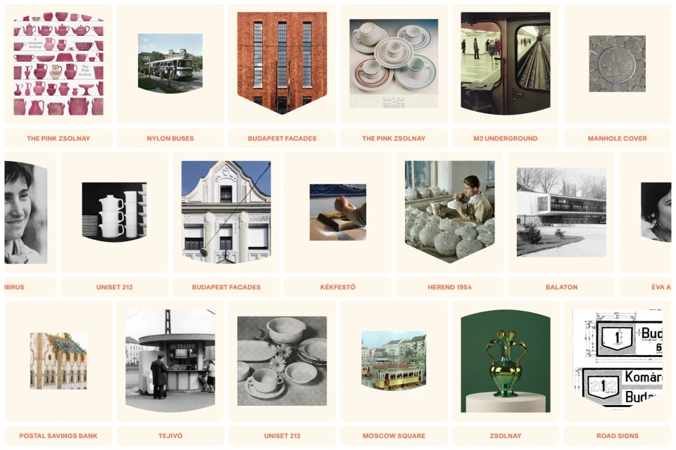
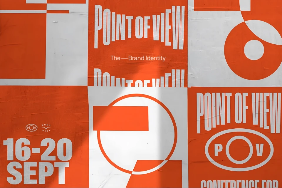
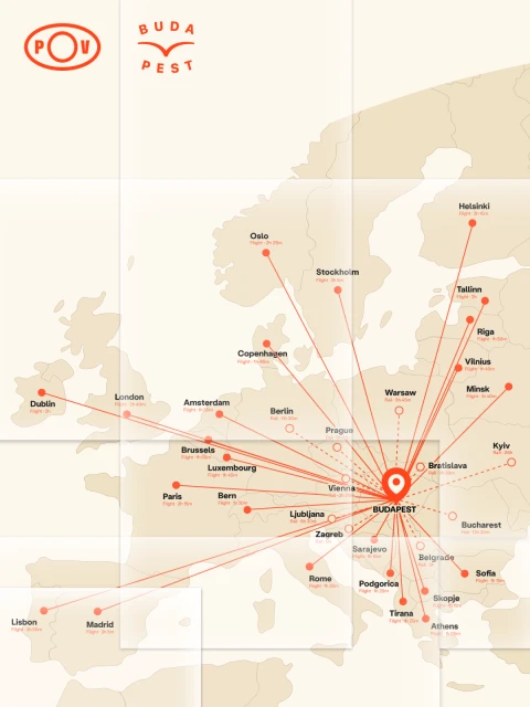
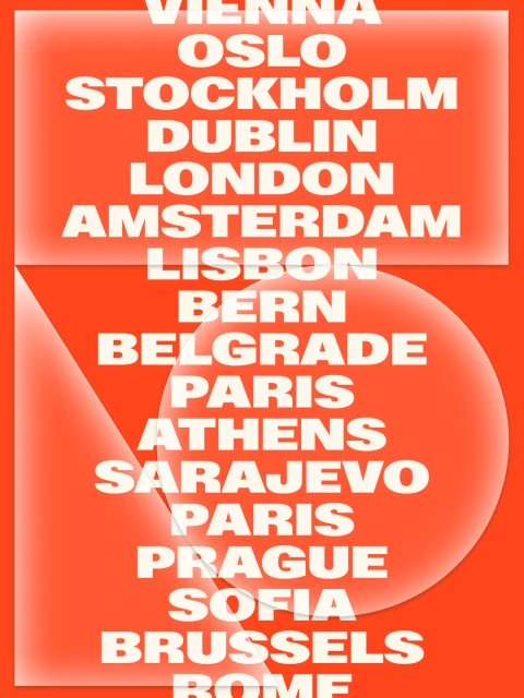
The third edition of the Point of View identity project reimagines the intersection of commercial design and editorial storytelling through a meticulously structured grid system that feels both architectural and kinetic. By leveraging a high-contrast orange and white palette, the visual language breathes life into the brand, transforming static information into an immersive graphic experience. CM.SUPPLY and COMET lead the creative execution, leaning into the tension between minimalist, monochromatic mapping and bold, experimental typography to anchor the identity in a contemporary context. The work makes frequent use of vector elements and clean, sans-serif typefaces to ensure that every modular panel feels intentional and balanced, whether it is documenting geographic hubs across Europe or highlighting festival-specific data. This project avoids the pitfalls of decorative design, opting instead for a rigorous grid-based approach that highlights the rhythm of city names and the precision of geometric forms. By integrating editorial sensibilities with UI illustration techniques, the identity functions as a cohesive navigation tool that invites the viewer to look closer at the interplay between space and structure. It is a masterclass in modern commercial design, where the identity does not merely exist but actively moves through the material, creating a distinct visual pulse that is consistently sophisticated, highly legible, and distinctly memorable for its disciplined application of form and color.
Graphic, Vertical
Motion Graphics
Solid Colour
Brand Film / Corporate Video
