
Postcrisis: Brand Identity
Jun 2020
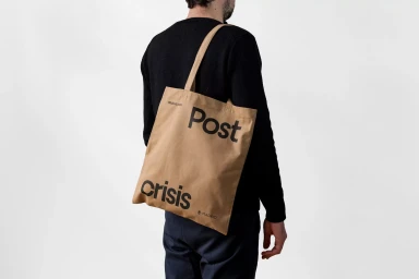
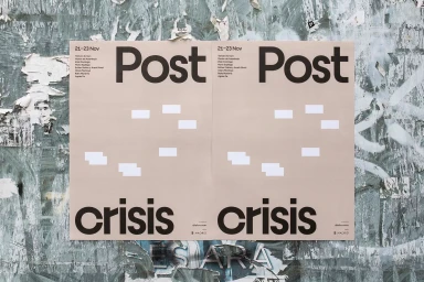
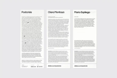
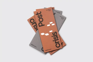
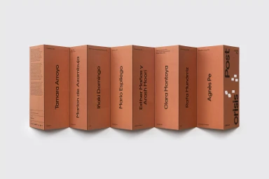
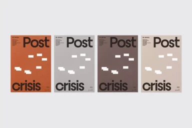
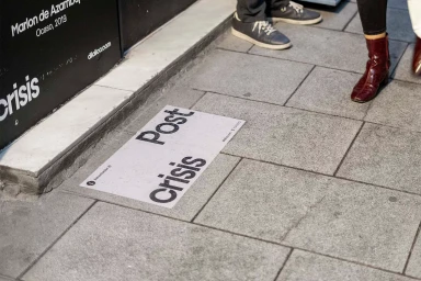
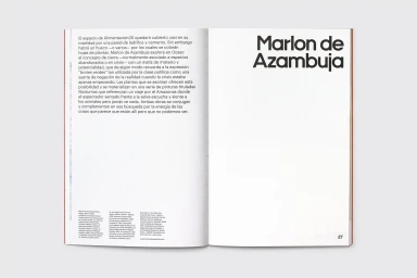
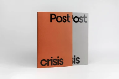
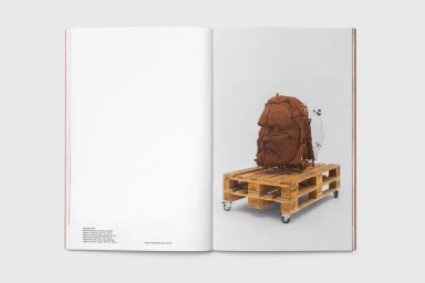
The brand identity for Postcrisis represents a masterful exercise in editorial minimalism, weaving together structured graphic design and tactical material application to define a distinct visual language. Orchestrated by the design studio Fase with photography by Galerna Foto, the identity leans heavily into a brutalist-adjacent aesthetic that prioritizes bold sans-serif typography and a disciplined, modular grid system. By utilizing a restrained color palette of burnt orange, cool grey, and deep taupe, the branding manages to remain consistent across diverse mediums, from commercial product collateral and matte-finish brochures to site-specific urban signage. The project effectively bridges the gap between digital media and physical art, using typography-led layouts that feel both highly contemporary and inherently architectural. Through the use of natural light and soft lighting techniques, the photography highlights the tactile qualities of the print materials, emphasizing the heavy cardstock and matte textures that ground the digital-forward brand. The identity balances chaotic, organic urban backgrounds with sharp, clinical studio shots, creating a dialogue between the structured world of institutional communication and the messy reality of the street. This cohesive visual system reads as a sophisticated exploration of form and space, proving that even the most austere graphic elements can command significant presence when executed with precision, rhythm, and a deep respect for white space.
Clean, Horizontal, Commercial, Minimalist
Advertising Campaign

