
Phaidon
Brand Identity
Jan 2018
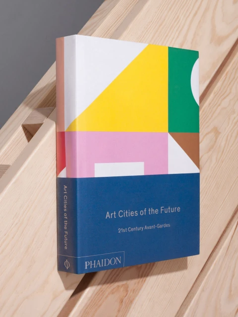
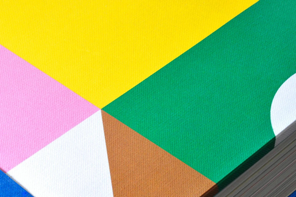
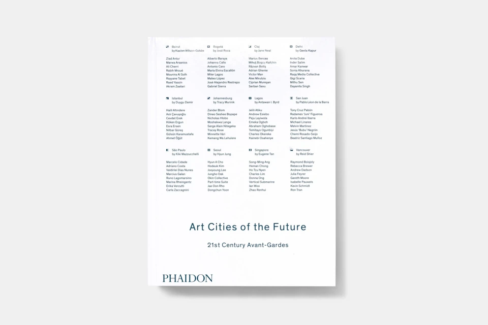
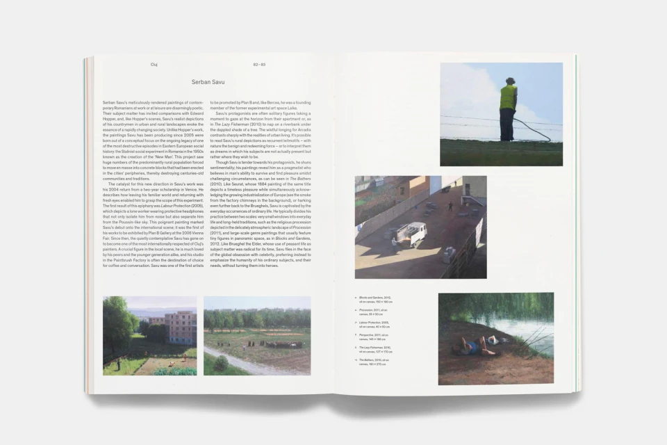
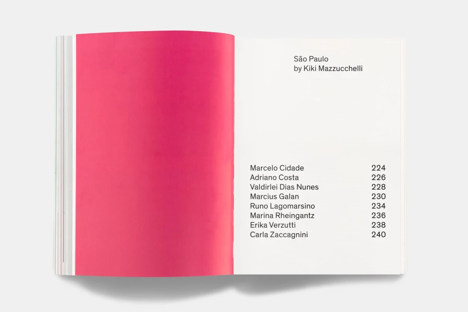
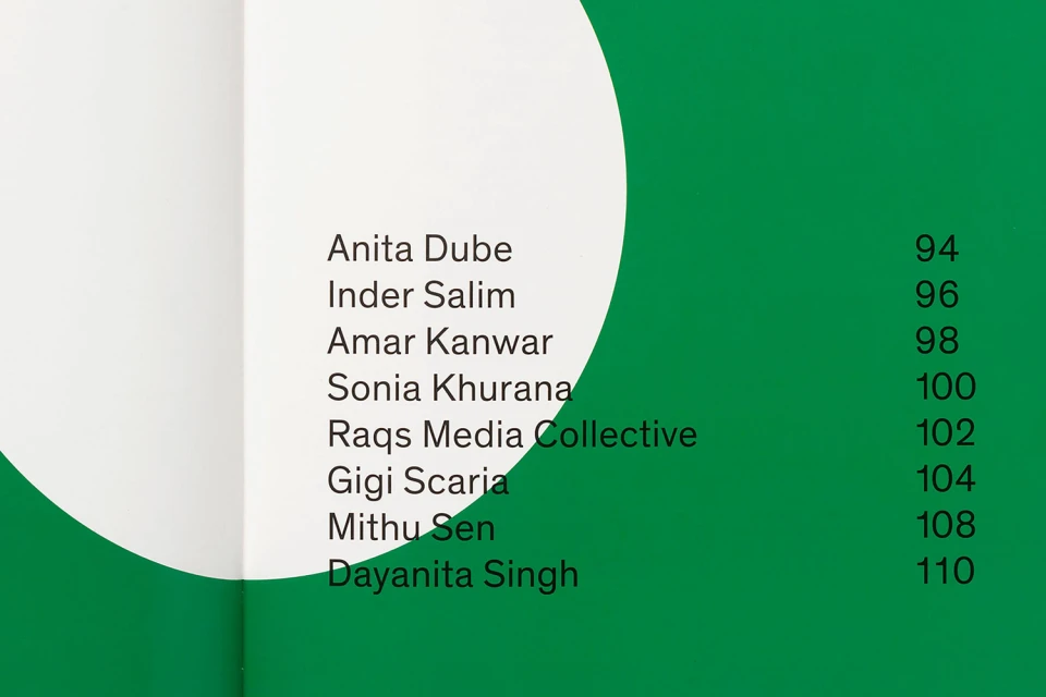
Phaidon has long defined the gold standard for visual publishing, and this recent brand identity project reinforces that reputation through a masterclass in editorial minimalism. Through a series of high-end product shots and internal spreads, the work translates the publisher’s commitment to contemporary art into a tangible graphic language. The project leans into a rigorous application of typography, utilizing a clean, sans-serif aesthetic that anchors the vibrant, geometric abstractions found on various dust jackets. By balancing saturated color blocks—ranging from deep blues to punchy pinks and greens—with systematic, structured grids, the design successfully bridges the gap between commercial appeal and intellectual authority. The execution is marked by a deliberate restraint, visible in the way light interacts with matte paper stocks and precise binding, elevated further by the technical polish of 3D render and studio strobe imagery. With graphic design led by Spencer Fenton, the publication layouts prioritize clarity and hierarchy, ensuring that complex information regarding city-based avant-gardes and artist profiles remains accessible yet visually arresting. This project functions as an essential study in corporate brand cohesion, demonstrating how deliberate spatial arrangement and intentional use of negative space can elevate editorial design within the competitive digital media and entertainment landscape, resulting in a look that feels both timeless and distinctly contemporary.
Clean, Minimalist, Horizontal
Typography
Magazines
